"The color of Mrs. Hawking"
Color choice in theater has always been very important to me. As a visual medium, it can add a great deal to the experience, and I think you can invest a lot of medium when color is carefully chosen.

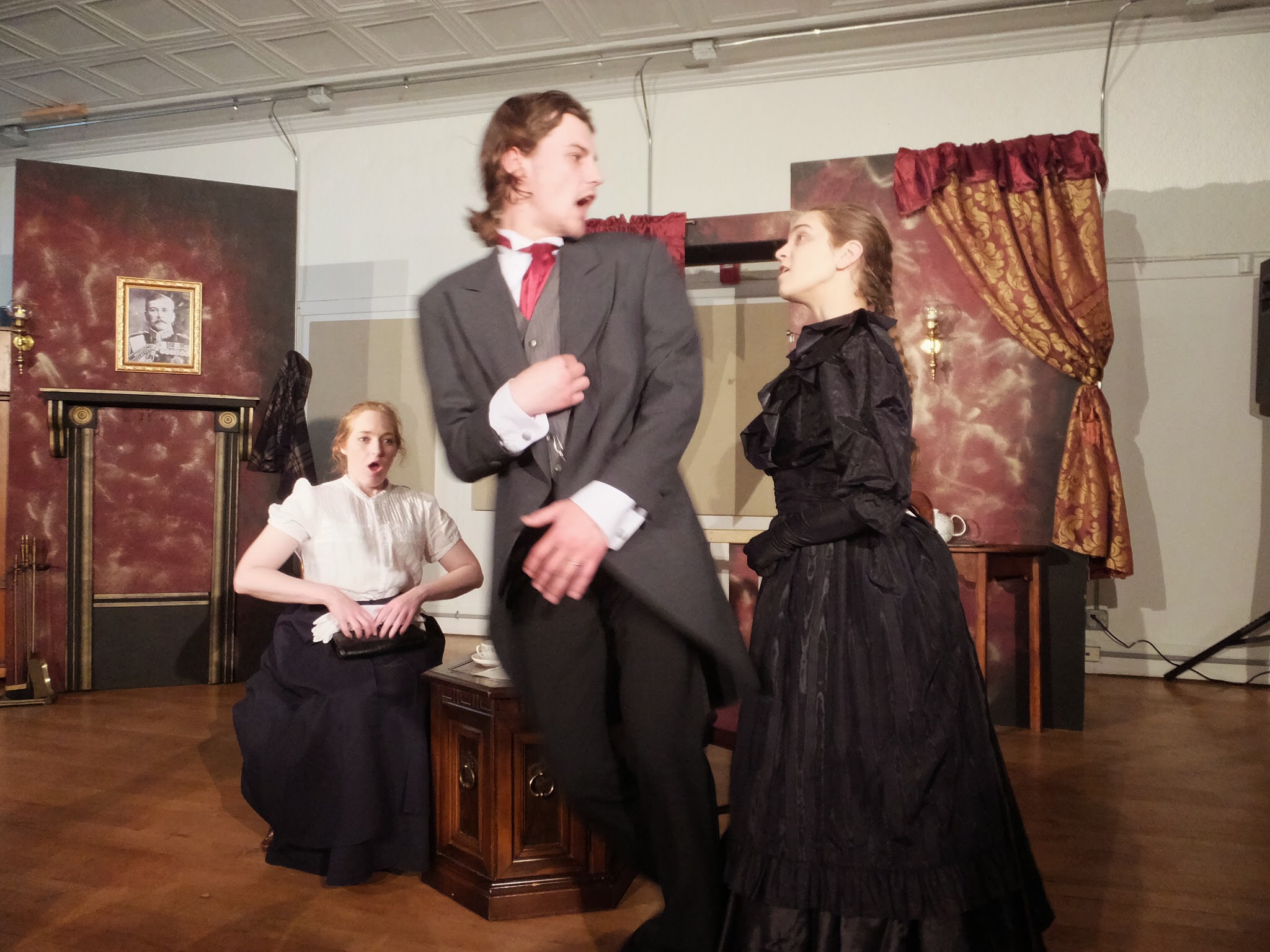
Though not as a firm rule, we stuck to a very definite color palette in Mrs. Hawking. It was partially luck, as in many things, such as the costume design, we were limited by what we were able to acquire on our budget. But as anyone who is family with my own design tendencies would notice, I am often drawn to particular colors, in particular combinations when I’m working on the production design of shows.
Mrs. Hawking is mostly focused in a limited palette of six colors, specifically set up as dichotomies: red and blue, black and white, silver and gold. It’s not the first time I’ve sampled from that selection, as I find they’re highly evocative combinations. The trick is not to necessarily make the audience understand exactly what you intended with them, but to encourage them to draw connections and notice juxtapositions.

Read the rest of the entry on Mrshawking.com!
Color choice in theater has always been very important to me. As a visual medium, it can add a great deal to the experience, and I think you can invest a lot of medium when color is carefully chosen.
Though not as a firm rule, we stuck to a very definite color palette in Mrs. Hawking. It was partially luck, as in many things, such as the costume design, we were limited by what we were able to acquire on our budget. But as anyone who is family with my own design tendencies would notice, I am often drawn to particular colors, in particular combinations when I’m working on the production design of shows.
Mrs. Hawking is mostly focused in a limited palette of six colors, specifically set up as dichotomies: red and blue, black and white, silver and gold. It’s not the first time I’ve sampled from that selection, as I find they’re highly evocative combinations. The trick is not to necessarily make the audience understand exactly what you intended with them, but to encourage them to draw connections and notice juxtapositions.

Read the rest of the entry on Mrshawking.com!