Beautiful and terrible as the dawn
Oct. 24th, 2025 09:30 amBeautiful and terrible as the dawn, all shall love me and despair.


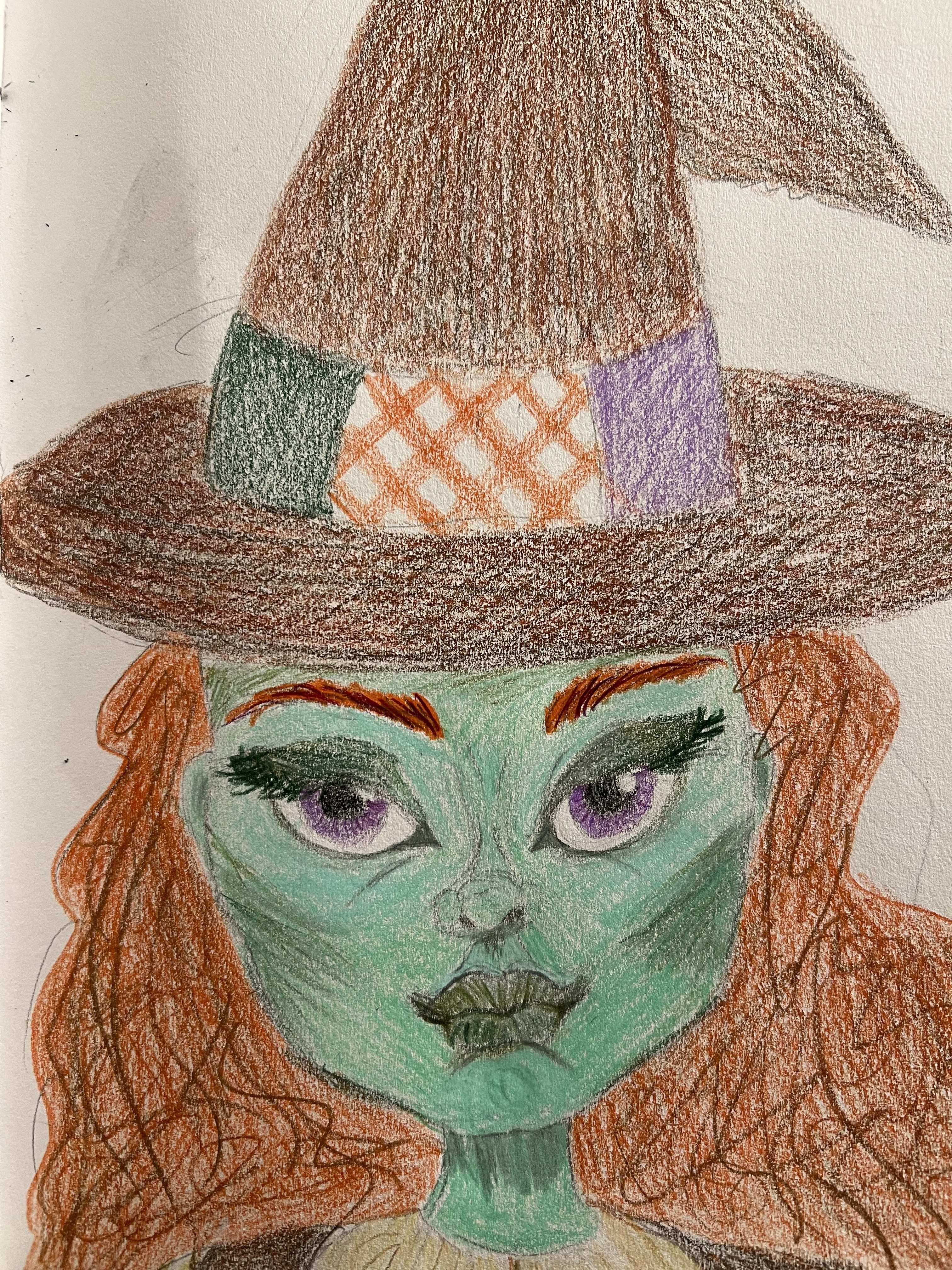
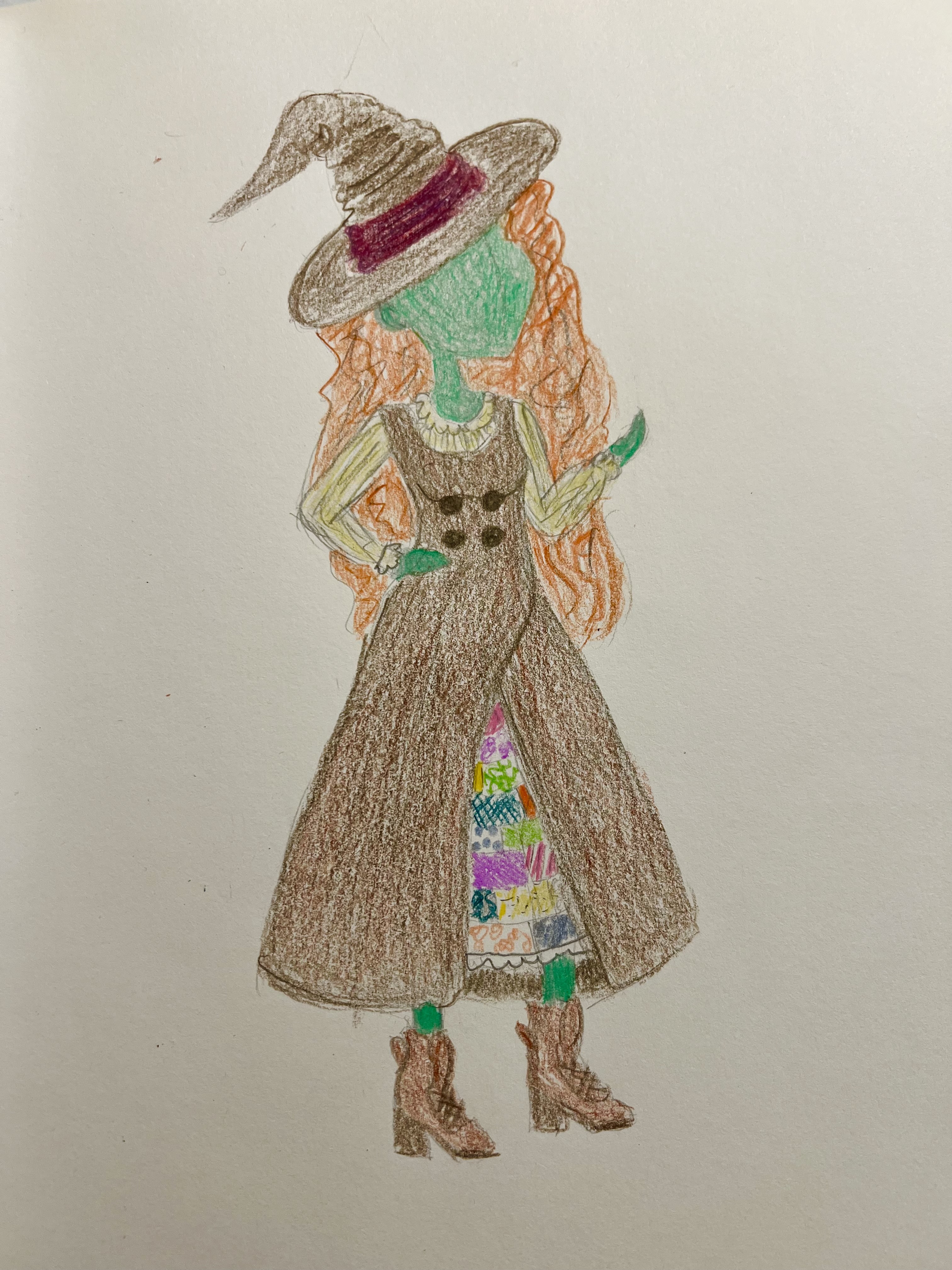
Taken by the talented Mark Edwards. I REALLY love these. I think I look beautiful here, but I particularly enjoy how ”in character” I look, like I’m being someone other than myself. It’s probably mostly Mark’s excellent photography and editing, but it also pleases me to see some of my own modeling skill on display.
These days I don’t do so much modeling anymore, unless it’s something for fun for a friend, because it’s mostly not worth the trouble unless I’m getting paid A LOT. But I used to be kind of good at it, beyond just being skinny with symmetrical features. I mean, it’s not exactly digging ditches or brain surgery, but it takes some effort and skill. I would tell folks, it isn’t just about looking pretty on camera; it’s about projecting an impression that can be captured on camera. You have to know what your body and your face does in a still image and manipulate it to create a whole vibe, a whole persona, only in your still image. It’s similar to acting, but you don’t have some of the otherwise natural tools— no voice, no breath, no motion, no space-filling, no micro-expression —to contextualize you. Of course styling helps, but the limited image of your physical instrument is all you can use to communicate.
So I not only like these because I look good in them, but I can see something of my own modeling skill in them. Like, these are not-Phoebe expressions in these pictures; that’s not how Phoebe holds her face. That is the face of a powerful and slightly creepy witch queen character who I had to assume. Kind of proud of myself that I’m still able to do that.
And of course, you need a good photographer.
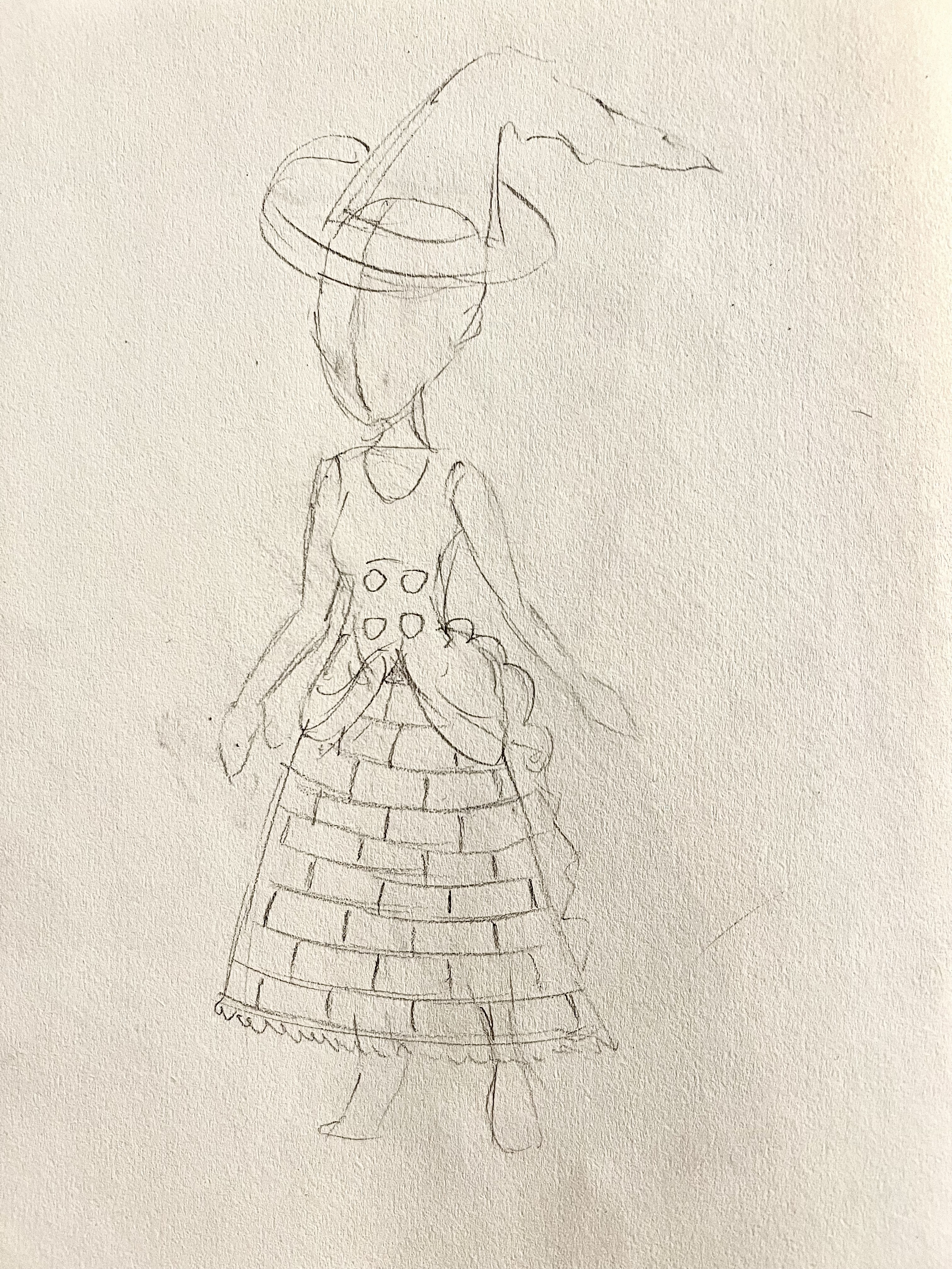
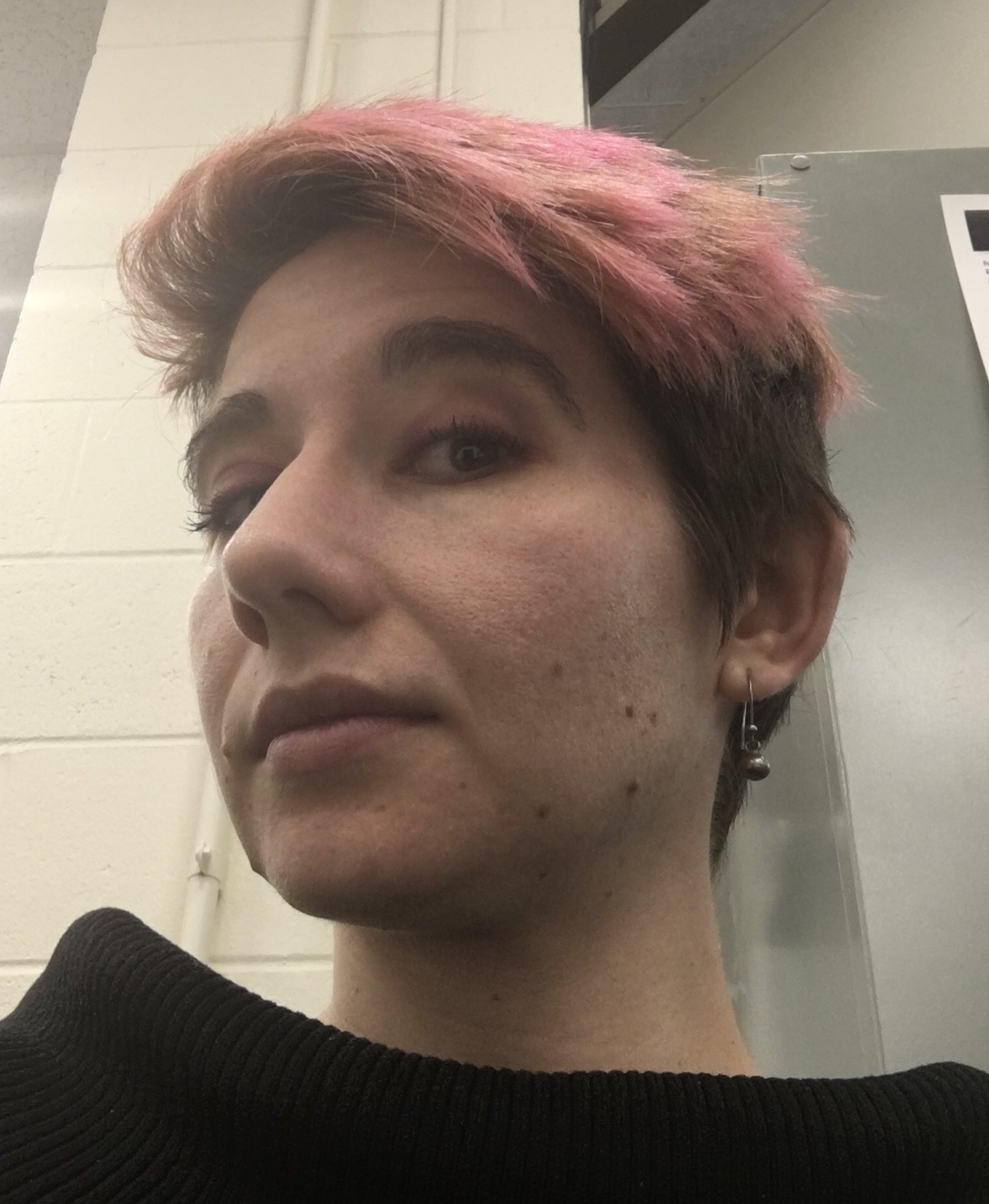