breakinglight11: (Default)
Color sense really isn’t my best skill. Right now I’m working on an art project where I need to come up with color palettes for individual items, consisting of at least three or four colors each, and I’m struggling.

While I’m very interested in color and can see minor gradations in it, I find that I am mostly drawn towards very basic combinations when required to put them together. You can see it in my dress sense; while I think I’m pretty good at putting together outfits that look nice, they are almost always limited to just a few tones. I’m lucky that I look good in most colors and do wear a wide variety, but in any one outfit I gravitate towards one vibrant shade with a few neutrals, or various shades of all one hue. Like, teal with black and white, or various shades of oxblood with dark gray. It looks fine, but often it’s more interesting and sophisticated to combine several bright colors that compliment each other in unexpected ways. I also do this in my costume design, where I assign a general color to characters and otherwise only permit them neutrals, and often default to obvious palettes like red versus blue.

I’d like to get better at that, particularly since I think it would suit this project, but it’s hard. Right now my strategy has been to Google combinations and see what other people put together, hoping for inspiration. Maybe this kind of research will help train my eye so that I can get better at coming up with these things myself. Anything to not just default to a bright with two neutrals, or lots of tone-on-tone.
breakinglight11: (Default)
Took another crack at this doll design. I drew another Monster High croquis to slightly alter the costume idea.

I tried the first thing that occurred to me, to make the “overdress” into kind of like a bustle corset, similar to the sort sold by Pendragon Costumes here.


But I found once I’d drawn it, I didn’t like it as much as I thought I would. The outfit looked unbalanced. I considered doing a back view to draw it as more of a vest with tails, but I didn’t like how the patchwork skirt looked without the overdress to tone it down. So I erased and tried again.


Here I extended the skirt full-length again, but widened the gap. I think I like this better; you can still see most of the elaborate patchwork while still feeling like she’s wearing an overdress. I kept the bustle, but I don’t know if I need that with the longer skirt. I picture her as a simple forest-dweller, and probably wouldn’t wear that kind of frippery.


Here’s the new version with color. I kept the color scheme from the original draft, but changed the hatband to match the patchwork skirt. I think I’m sold on using the mint-green doll and giving her red hair. I also seem to have made the skirt longer, though I still want it to stop at the ankle— that makes sense for wandering through the woods. I also drew her hair significantly shorter, but I think I prefer the longer length in the earlier picture.

I’ve been gathering supplies to make her for a while now, and I think I have everything I need. The paint, the fabric, the tools. I’ve got a doll I can prepare, though I haven’t done it yet. The only thing I should probably do before digging in is draw a plan for her face. I’m excited to try that, as I’ve seen many doll artists do it and it looks like fun. But I want to go in with a plan in hopes of doing a better job, and coming up with something that suits the character in my mind.
breakinglight11: (Default)
I keep wanting to work on a doll customization project, but I guess I’ve been a bit hesitant to really dive in. Recently I saw an ad for a really cute combination of a brown tweed dress over a quilted patchwork underskirt, and while it isn’t the sort of thing I’d wan to wear, I thought it would make a fun outfit to make for a doll. So I decided to see if it might help me get started to draw a design for a doll I could make, an adorable cottagecore witch.

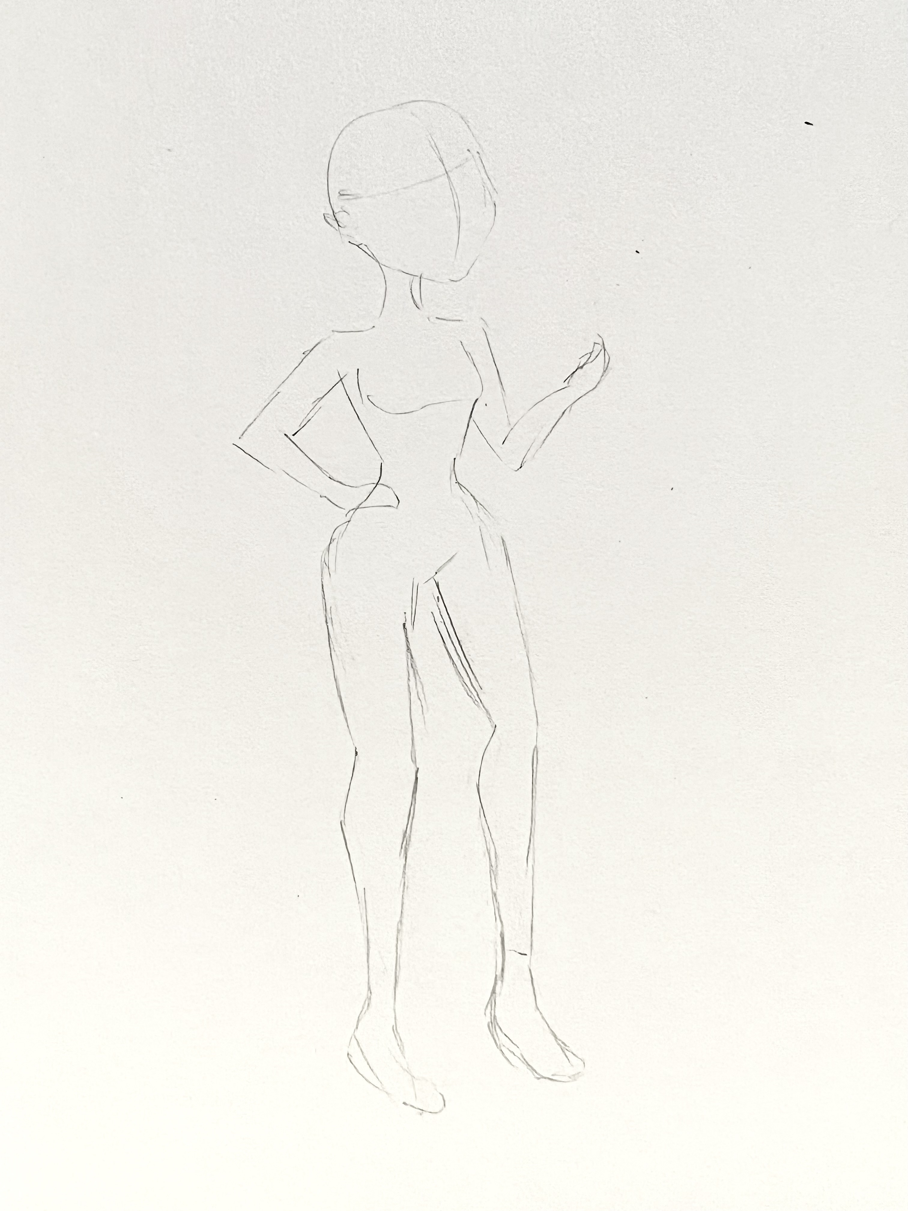
I decided to look up for a reference image to make a Monster High croquis, or a sketch used for fashion design. I copied that image by eye:


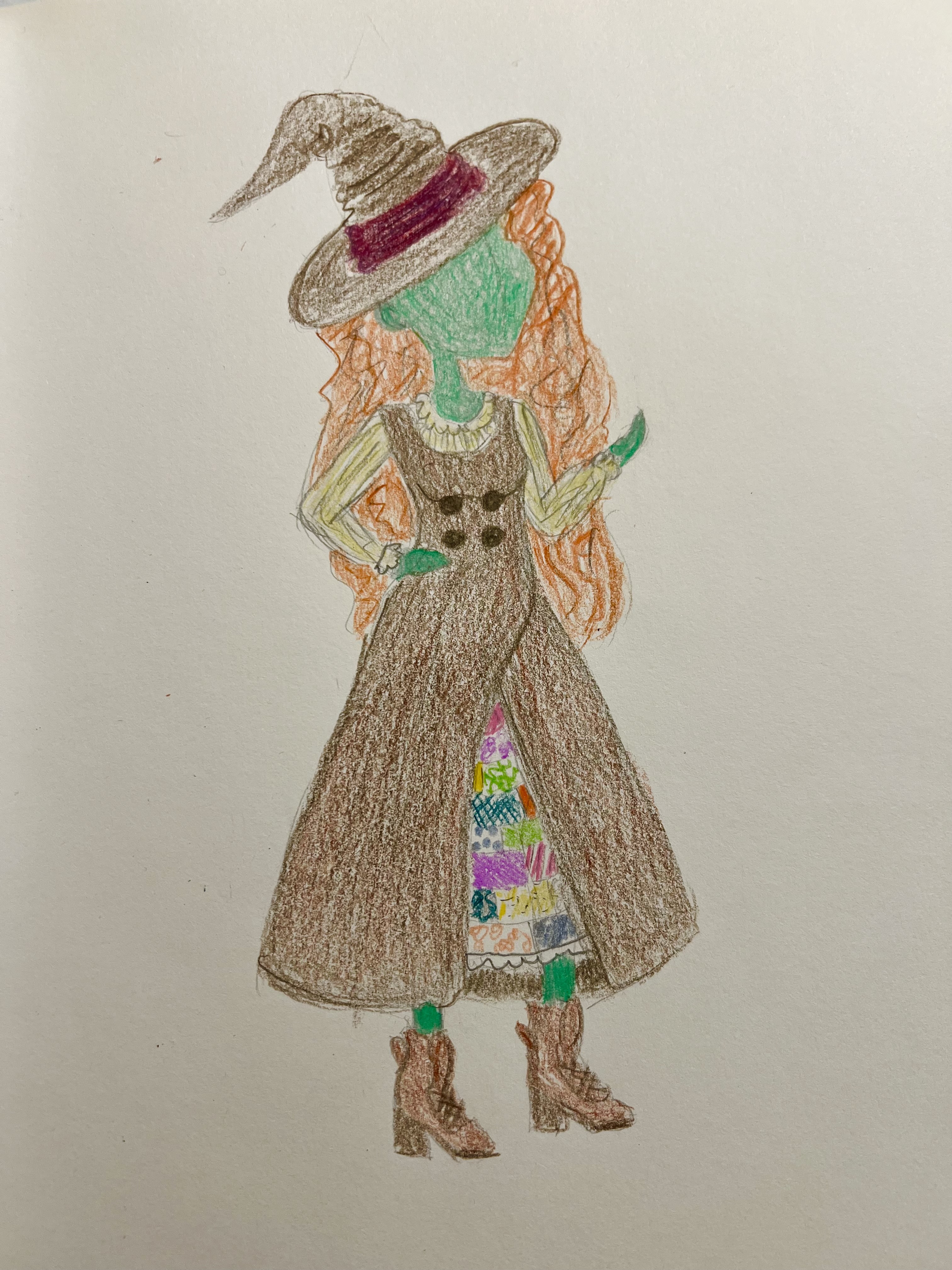
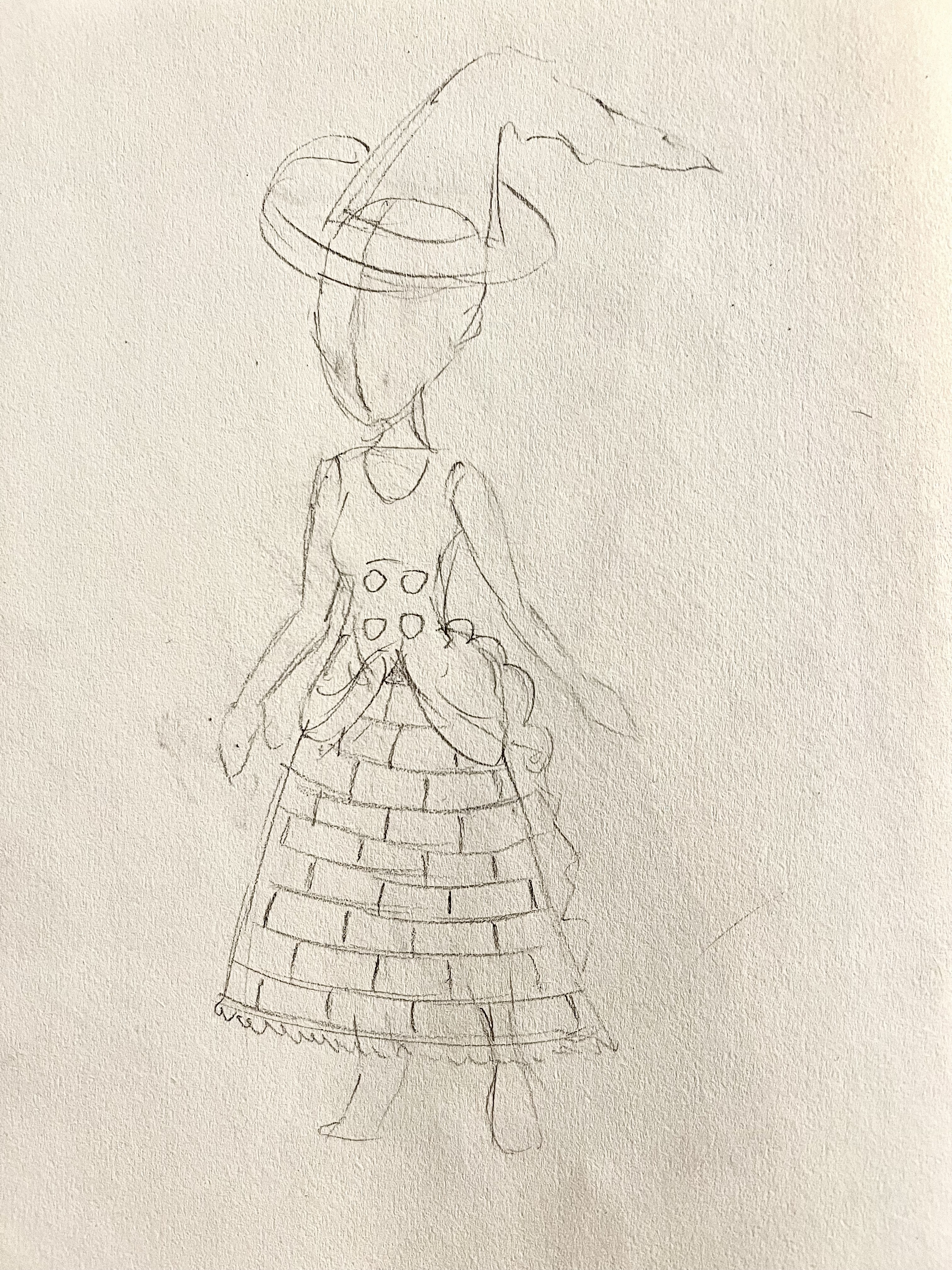
Then I did a pencil drawing of the outfit. As I said, it’s very inspired by a Linennaive ad, specifically the brown tweed over the homey patchwork. In my version, I want to see the underskirt more, as it will be visually interesting and probably a fair bit of labor to make. So I created a sort of double-breasted wrap design that would split open in the front. A witch hatch with a kinked crown and granny boots complete the look:


Then I experimented with color. I wanted her to have big, unruly curls, and I thought red would work well with the rest of the imagined color palette. I’m thinking the patchwork will be whatever scraps I have in my fabric, but if I can keep the tones pastel that would look nice with the warm brown of the dress. I haven’t totally settled on what base doll to use, but right now I’m leaning toward an old G1 Monster High Frankie Stein. I think the mint green skin would work with the rest of the palette.


I asked Bernie for some feedback, and he said the underskirt was so interesting, I might want to show even more of it. It made me think instead of an overdress, she could have a brown tweed vest with a bustle in the back, and just show all of the patchwork. I might like that even better, and it would take it farther away from its original inspiration. He also suggested using the patchwork on the hat band as well.

I think I might do another draft before I actually try to make her. But I think she could shape up into something really cute.
breakinglight11: (Default)
MRS. HAWKING SPILLS THE TEA! A collection of behind-the-scenes looks at the making of the Mrs. Hawking shows, in the lead up to our live and filmed performances at Arisia 2024.

Previous episodes:
1. Intro
2. Costumes


Mrs. Hawking Spills the Tea - Episode 3 - GRWM with Arthur Swann

What does it take to be one of London's finest peelers (or police, for those not up on their Victorian slang)? Actor Matt Kamm takes us behind the scenes as he gets into costume to play Arthur Swann in the Mrs. Hawking shows!

#MrsHawkingSpillsTheTea #MrsHawking #setlife #backstage #actor #makingof #film #actorlife #GRWM #theater #theatercostumes #costumes #arisia #victorian #victoriancostume #costuming #costumedesign #technicaltheater #superhero #femalesuperhero #newplay #arisia2024 #behindthescenes

Video by Cari Keebaugh. Featuring Matthew Kamm.

Mrs. Hawking Part 6: FALLEN WOMEN will be performed at Arisia 2024 at 5pm on Saturday, January 13th at the Boston Westin Seaport. Register for the con to see our show: Arisia.org.
breakinglight11: (Default)
MRS. HAWKING SPILLS THE TEA! A collection of behind-the-scenes looks at the making of the Mrs. Hawking shows, in the lead up to our live and filmed performances at Arisia 2024.

Previous episodes:
1. Intro


Mrs. Hawking Spills the Tea - Episode 2 - Costuming the world of Mrs. Hawking

Good costuming can help immerse audiences (and actors!) into the world of the show. In this episode of Mrs. Hawking Spills the Tea, we talk about some of our favorite costumes and how we use colors to help tell the characters’ stories.

Video by Cari Keebaugh. With interviews with Naomi Floro, Kate Potter, Christian Krenek, Coryn May, Jackie Freyman, Arielle Kaplan, and Phoebe Roberts.

Mrs. Hawking Part 6: FALLEN WOMEN will be performed at Arisia 2024 at 5pm on Saturday, January 13th at the Boston Westin Seaport. Register for the con to see our show: Arisia.org.
breakinglight11: (Default)


I am kind of fascinated by the presentation of Tenoch Huerta as Namor in the new Black Panther movie. Not just because of the Central American aesthetic; that was definitely unexpected, though very welcome to me, seeing as it’s gorgeously rendered and a very cool artistic inspiration from a culture not previously much referenced in the Marvel universe. More because of the vibe they gave him.

Namor, like every other long-running comics character, has been interpreted in a variety of different ways, from imperious ocean wizard to smarmy undersea fuck boy. I confess I’ve always preferred the latter, watching him “hey, girl” at Sue Storm in front of her husband and scoff at people too unsophisticated to appreciate the charms of the shrimp queen. For years I’ve been cracking, “I can’t wait to see what twenty-five-year-old underwear model they cast to play him.” I was picturing a chiseled, smooth-skinned boy-man, preening and lip-biting as he imposed himself through ego and brazen sexuality. While there is a basis for Slutty Namor(TM), I admit the limits my particular biases and tastes on the topic placed on my imagination.

But Tenoch Huerta and the way they present him isn’t any of those things. In the trailers, he projects ten thousand percent, pure, weapons-grade MAJESTY. In real life, Huerta is a cute guy, even kind of sweet-faced. And you don’t get cast as an MCU superhero unless you’ve got BODY. But his beauty is in a shock and awe sort of way, blowing you away with his presence, his costume nothing but a few adornments meant to emphasize his status. Torque, headdress, jade jewelry. The bareness of his body seems to not to have any of the usual semiotics of nakedness— it’s not about honesty, or vulnerability, or even sexualization. It’s like a declaration of power, that his lack of concealment or protection of any kind is because he is too mighty to need it. More than anything it reminds me, weirdly enough, of dark Galadriel in Peter Jackson’s Lord of the Rings, beautiful and terrible as the dawn. Untouchable, imposing, and above all else, magisterial.

I was very surprised by it, but I’m super intrigued. This approach feels so fresh and I can’t wait to see what they do with it.

breakinglight11: (Default)
I kind of posted about this on the Mrs. Hawking page, but man, even putting all the stuff away after shows is a lot of work.


I’ve unloaded everything into either my house or the storage unit, and all the props and set pieces are put away. I opened up all the costume bags, stripped out the washables for washing, and sprayed down all the dry-clean-only with alcohol. Stuff that will be used for the next round of shows gets repacked and hung in the large costume closet, while the items that are done with have been pulled for longer-term storage.


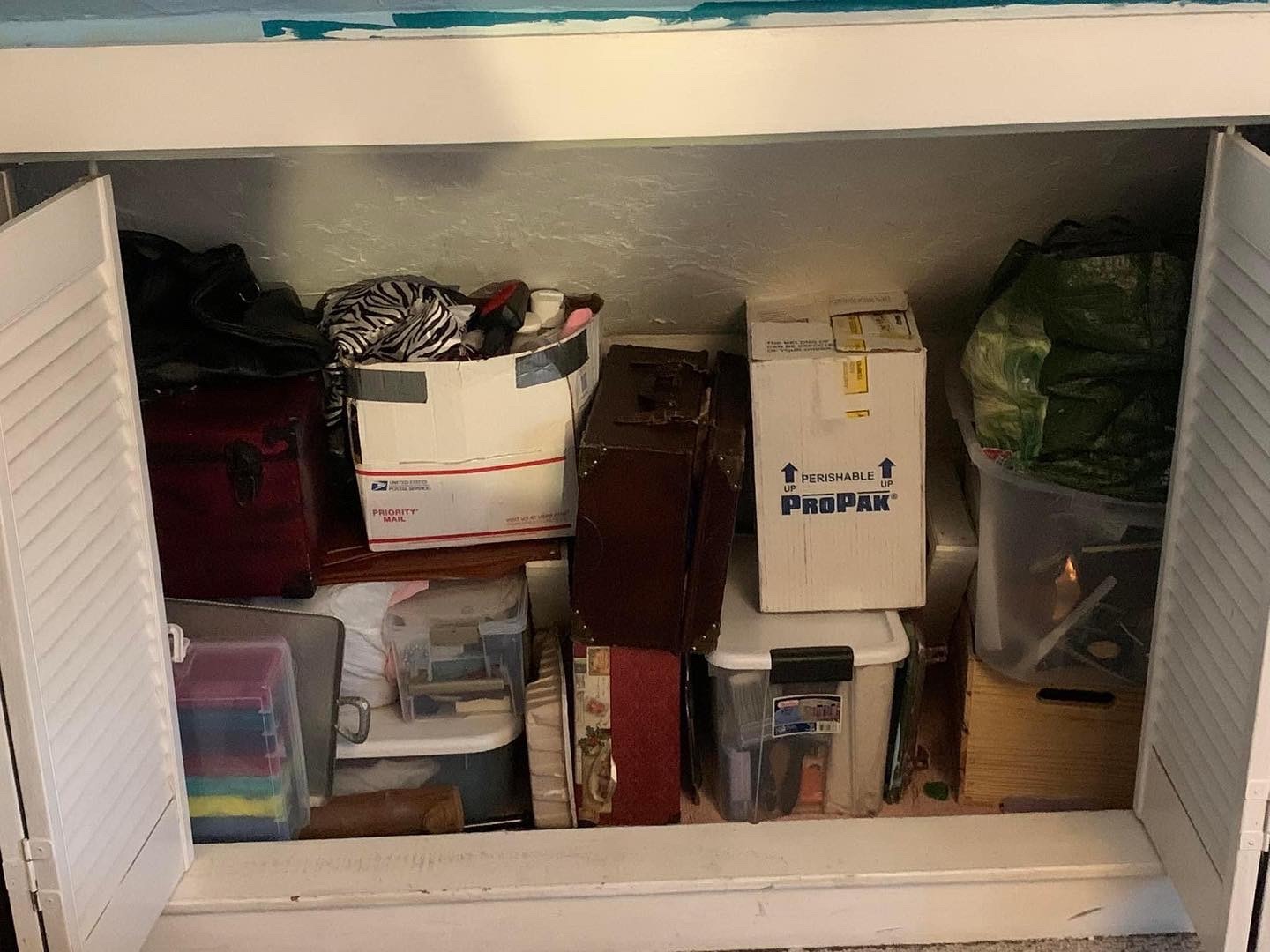
I still have to do all that washing, replace it in the right bags, and put the done-with pieces away. There’s just so much of it now, since as I’ve been ceaselessly complaining, my costume collection has gotten out of control. I know I’ve been saying this forever, but I really need to do a purge— if only so I have the physical space to keep it. I’m just so nervous of getting rid of anything because every time I have a new actor to dress I need stuff in the right sizes and colors.

I’m pretty blasted still from the last two weeks, and I know getting into all that will mean more work. But if I just want to get it put away, there’s got to be space for it to go! So I may not have choice in the matter.
breakinglight11: (Default)
I was unaware that Mr. Global is a thing. How did the Internet manage to keep this from me?

It is generally about as tacky with the costumes as Miss Universe, which I appreciate. My favorite is Mr. Vietnam, who I think best balances looking hot with not looking ridiculous. Honorable mentions to Mr. Philippines, Mr. Puerto Rico, Mr. Laos, and Mr. Hong Kong.

Mr. Cambodia, Mr. UK, Mr. Malaysia, Mr. Korea, and Mr. India manage to stay pretty classy. Mr. Macau is doing the exact opposite of that, and I am here for it.

Mr. Peru, Mr. Mexico, Mr. Bolivia, Mr. Thailand, Mr. Sri Lanka, Mr. South Africa, Mr. Panama, Mr. Nigeria, Mr. Indonesia, and Mr. Ecuador would like their Miss Universe counterparts to know THEY WILL NOT BE OUTDONE. Bless you, gentlemen. And your abs.

Mr. Czechia, Mr. Romania, and Mr. Myanmar are straight-up in folk costume. Mr. Brazil and Mr. Dominican Republic are in the same vein, except for Sexy Halloween.

Mr. Venezuela was dressed by his mom for this, you guys.

I respect Mr. Spain for going there.

Mr. Japan is perhaps approaching this with… a slightly different ethos.

Mr. Cuba made me burst out laughing, being almost TOO on point.

Mr. Switzerland and Mr. France don’t give a fuck.

Mr. United States is… pretty much living up to our reputation on the world stage.
breakinglight11: (Default)
Bernie wants me to watch The Mandalorian so he can discuss it with me. I will probably try for his sake, but I’m honestly not really interested. I’ve never been a Star Wars fan— I find it kind of cheesy and none of the characters have ever really grabbed me —and I’m often at a loss to see what inspires so much devotion beyond nostalgia. And one thing in particular is the enthusiasm people have for Boba Fett. While the Mandalorian bounty hunter of the show is not him, it’s clear the whole premise is trading off of the affection people have for the original character.

I’ve always been vaguely put off by how much people seem to like a character that has... nothing to him. In his original trilogy appearances, he has no personality. He accomplishes basically nothing, so it’s not like he’s a badass, or even an effective threat. He misses every shot he takes and dies like an absolute bitch, in a moment that feels like the narrative is trying to get rid of him as quickly as possible because it doesn’t want to deal with him anymore.

I’ve always found him ridiculous because of this. However, I really OUGHT to like him— because, in his popularity, he proves a point that’s really important to me. WHY do people like Boba Fett? Because his costume is so cool.


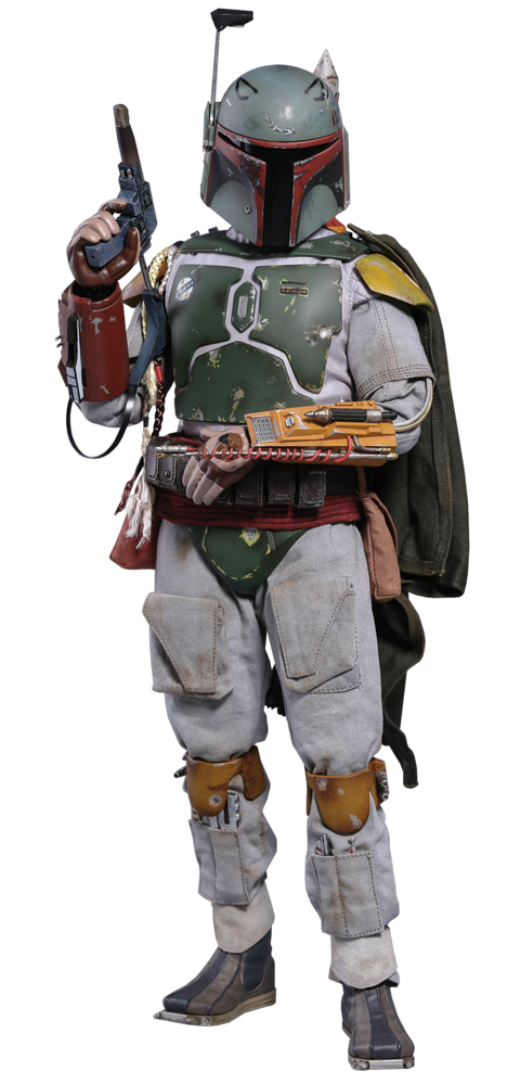
That’s basically all there is too him, in the absence of a personality or meaningful action. He doesn’t even have hair or a face or even much of a voice; the costume is literally all that’s there. And its design is sufficiently evocative and imagination-capturing to enable so many people to latch onto him and do their own filling in of a personality behind the armor.

He’s the literal perfect example of how much a costume can create a character. The idea that costumes are NARRATIVE, that they can be packed with INFORMATION, is something I believe really strongly. People read them and receive messages from them whether they realize it or not.

And this look is unique and evocative. It looks worn and lived-in, giving him the sense of experience and having survived rough conditions, while also keeping with the very everything-is-junk look of most non-Imperial tech. He is scrappy, practical, weathered. He still looks at home on dull sand planets but also introduces an unusual his color scheme for the otherwise very chiaroscuro films, with its red-yellow-green combination. It feels like a real, lived-in commando look, while still capturing the spaceman aesthetic. It’s aged really well, too, despite having been designed in a decade where a LOT of the aesthetic has not. And his lack of distinguishing features make it easy to imagine who he might be— specifically, whoever you want him to be.

If anybody ever doubts the power of costume design, he’s the perfect example to point to. A multi-decade long fan obsession, spawned by literally nothing but an evocative suit.
breakinglight11: (Default)
As with all other aspects of a filmic narrative, there are many different creative arts that are combined to tell the story. All these elements may be handled by different artists with different areas of expertise, but ideally they are all practicing their crafts together in concert to serve the vision in whatever way they can. And they can do even more than the more notional elements of the story. As I like to say, the script is god, but aesthetics are king— all the story elements may have been created with the text, but the more sensory elements, such as the visuals, have a more immediate impact on the audience, and therefore a more visceral power to influence the audience’s perception.

Costuming design is one of these visual elements. Based on any number of qualities of clothing, a costumer can influence the way the viewer understands the characters, and convey any amount of information about the ideas, emotions, directions, connections, and conflicts of the story. This can be a subjective matter, often more a matter of suggestion and subject, but people tend to absorb ideas this way even if they can’t articulate them. When it comes to these ideas, costuming tends to work through two approaches— the diegetic, and the semiotic.

Diegetic costuming deals with the idea that these are the clothes the characters chose to wear within the world of the story. Any meaning comes out of the notions that these are characters dressing themselves, choosing their clothes due to who they are as people, what their circumstances are like, what their lives are like— largely in the manner that real people do. Costuming is much more curated than people’s everyday dressing choices, of course, and so can be trusted to be much more meaningful indicators than what a real person might wear on any given day. But from this school of thought, the designer works based on what a person like this character would choose to wear, given the nature of their personality and their circumstances. Therefore, you, the viewer, can use these choices to learn about who the characters are and what their lives are like, within the world of the narrative.

By contrast, semiotic costuming deal with the idea that costuming can be used to send messages the author wishes for the audience to receive, independently from anything a character decides deliberately or accidentally to wear. These are choices made simply for their narrative meaning, as opposed to the considerations a character would naturalistically take into account when selecting clothing. We might say this is where costuming choices become symbolic, indicating the themes, ideas, motifs, and meanings of the story that the characters wouldn’t necessarily be conscious of.

The line between these two approaches can blur, depending on how conscious a storyteller wants to make the characters of the communication inherent in clothing. Theoretically a character could be making a costuming choice in-universe to send a semiotic message. But it’s useful to have a grasp of the difference between these two approaches, because it helps identify possibilities for meaning beyond the confines of the character’s own naturalistic understanding of clothes.

In addition to these diegetic and semiotic concerns, there’s also the production level to be taken into consideration. This is when the forces of practicality, business, and finance necessitate certain design choices more than any narrative interest. Occasionally this refers to when the vagaries of life get in the way of theory— getting clothes on the bodies of the actors, working within the budget, dealing with the physical reality of acting in the costume, what items are within the designer’s access. While in an ideal world designers make all their choices because they do the most to serve the story, there are always going to be practical concerns.

When I am analyzing costumes, referring to the reason for and significance of any given costume choices, I attribute it to forces acting on various different levels of the piece. I think it’s good to be clear on that before performing any examination, so that the lens of approach is clear.
breakinglight11: (Default)
I am procrastinating my grading for the day, so I'm going to make good on my threat to write about my approach to low-budget costuming for a large number of people for a period piece— the gentlemen this time.

As I mentioned yesterday, this past weekend I did costuming for a period film set in 1915, "The Fair Fight" from Narrow Street Films. I spoke about how I handled the womenswear already, but now let's talk about dressing a large cast of men.

They are at once both easier and harder than women, depending on the issue. Menswear has not hugely changed over the course of two hundred years— the basic features of the suit have been fairly constant beyond minor aspects of detail and silhouette. The male uniform for this period is even more narrow and conformist than it was for women, basically a close-fitting structured wool suit in three pieces, with tapered trousers and a button down shirt with stiff collar and cuffs. Details and quality of fit vary with social class and time of day, but some variation on that was necessary for all the men.

The typical modern men's suit is descended from the sack suit of the time, a casual daytime outfit with a more relaxed fit and no tails, but modern jackets tend to have the top button way too low. Similarly, period trousers ought to sit at the true waist rather than the lower modern preference, and while we find a break in the pant leg appropriate, period cuffs should hang straight and terminate right at the bottom of the ankle. The easiest way to recreate this with modern clothes is with formalwear, which has changed very little over the past century. Tuxedo pants tend to have the right rise and taper, wingtip tuxedo shirts simulate the right collar, and morning coats and frock coats really make the silhouette. So I have amassed quite the collection, along with a bunch of vests in as many colors as possible.

But because there is such a uniformity among menswear— and a difficulty in finding tuxedo pieces in anything but black or gray —it often leads to a lot of men in the same dark suit, with no distinctive look or expression of character personality. So I bend the dressing rules a little, or a lot, for the sake of creating variation and saying something about the character. I had to interchange as much as I could— jacket style, vest color, tie color, tie style, hat or no hat —to make as many vaguely appropriate combinations as possible.


Take these four men. Three are wealthier and more upperclass, high-ranking soldiers and the brother of the wealthy industrialist, while the last is a respectable working class man. The upper class men are all in jackets, specifically frock coats, which these days are worn as outer coats for tuxedoes, and have that very high vamp. It looks like what such men might wear for a more informal occasion like a country fair, while the working class character is just in shirtsleeves. I specifically asked most jacket-wearing gentlemen not to button their coats, however, because I wanted the colors of their vests to be visible for distinction. I would have liked there to be a larger array of colors, but I was limited by fit. There's also a lot of variation in the ties, both in color and style; we have a cravat, two ascots, and a puff tie, which I did my best to coordinate with the vests. The millworker, played by Chris Dovidio, is also wearing a casual hat, in this case a Greek fisherman's cap.


This shot contains some of the same gentlemen, including Dan Dovidio and Ted Siok, but you'll also notice the one in the morning coat, played by Ken Neenan. His character is the head of the family at the center of the story, the rich owner of the mill, so I decided he could be more formally dressed than the others to present himself to the village. This brings in the gray of the morning coat along with its swallow-tailed shape, contrasting with the frock coats, and his gold striped vest and tie also helps him stand out.


Frock coats again, except for the gentleman in the center, played by Robb Buckland, who is actually wearing a sack coat, a less formal option. He's also in a bow tie and my only pair of hickory striped trousers, which properly probably are too formal for sack suiting, but I was limited in what fit who. I do like the look of them and wish I had more, but it's rare for people to own morning dress anymore so it's quite expensive to pick up. For the gentleman on the left, the pretentious rival mill foreman played by Chris Dubey, I wanted him to look like he was flashy and trying too hard, with his garish blues and awkward ascot. I usually use plain black Oxfords for shoes, as the low-heeled leather ankle boots more appropriate to the time are harder to find, but as you can see some people preferred to wear their own.


A drunk and a cop. The cop, played by Caio Avraim, is wearing the bobby-esque coat I use for London police officers in Mrs. Hawking. His cap doesn't really go, but unfortunately nothing more appropriate fit him and I felt like he needed a hat. The drunk, played by Dan O'Brien, is a mishmash of my rougher-looking stuff, and I made a point of not ironing anything he was wearing.


The one cheat I was most annoyed at having to make was for Terry Traynor, playing Terrence O'Neil the butler. I knew the director KJ Traynor wanted him in livery, but I didn't have a black morning coat that would fit him, which would have been standard for the uniform during the day. So he's wearing evening tails. It doesn't look out of the question for what the casual eye would expect for a butler in livery, but it's not right if you know what to look for. (You can also see the maid and the housekeeper characters in casual daywear in this shot.)

Overall, I'm pretty pleased. Didn't have to resort to a sea of uniform black suits. But I have put off my grading long enough, and ought to get back on it.
breakinglight11: (Default)
This weekend I did costuming for a period film set in 1915, "The Fair Fight" from Narrow Street Films, directed by KJ Traynor and Terry Traynor, who I met because he did some excellent fight choreography on my movie. I've become kind of known for my ability to fake long-19th-Century-appropriate costuming on a low budget, thanks to a number of years' experience working on Mrs. Hawking and the corresponding very large collection of suiting, dresses, long skirts, and high-collared shirts one builds in that process.

It was quite a large cast and utilitized a large chunk of my stock, particularly for the men. I had almost no daywear to spare at all after dressing the guys. In situations like that, it can be hard to make the characters distinctive in any way, when you're struggling just to get everybody dressed in something that looks right. But I collected some pictures from the set that I thought kind of demonstrated the approach I take to dealing with that particular costuming challenge.

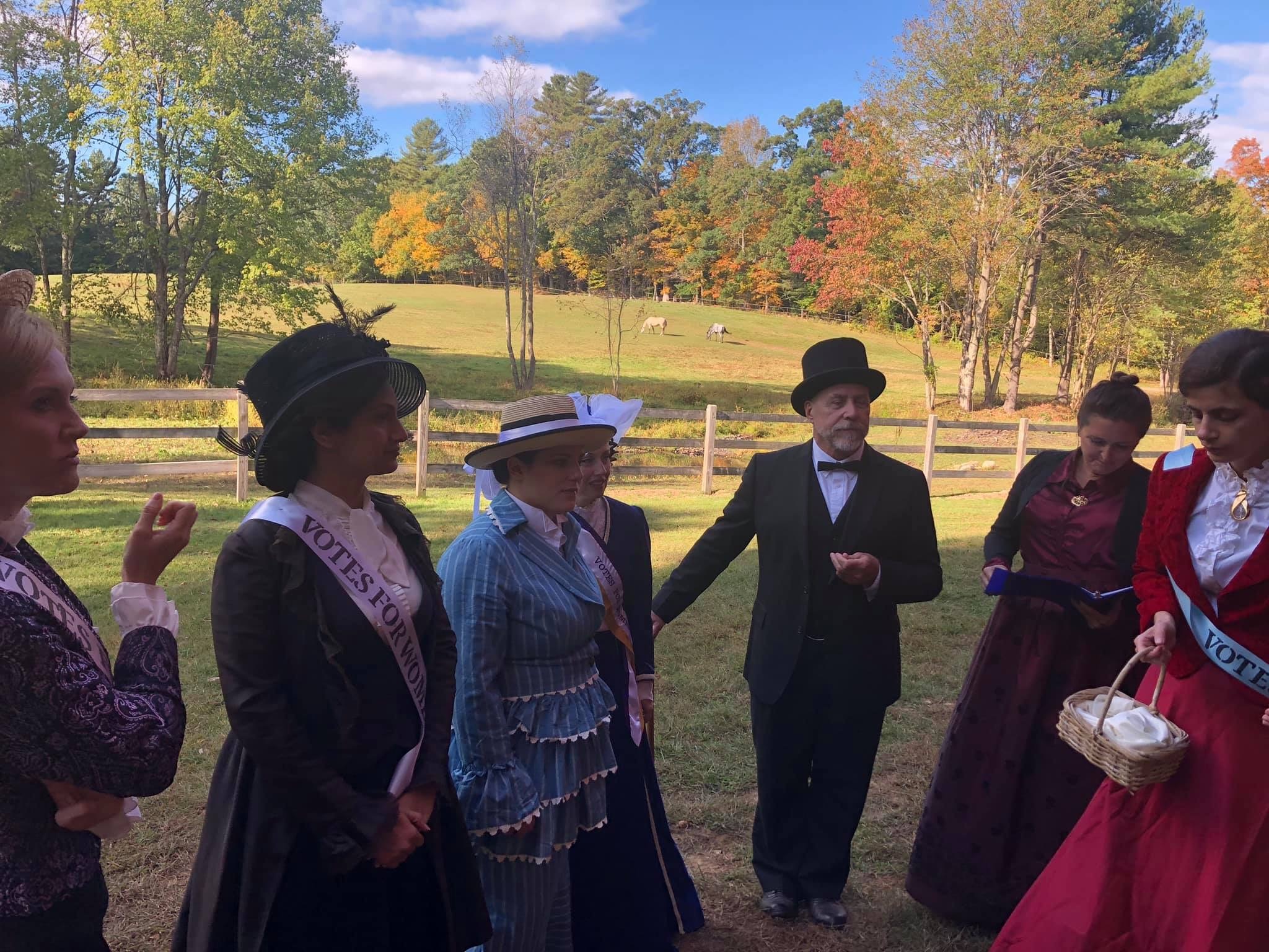
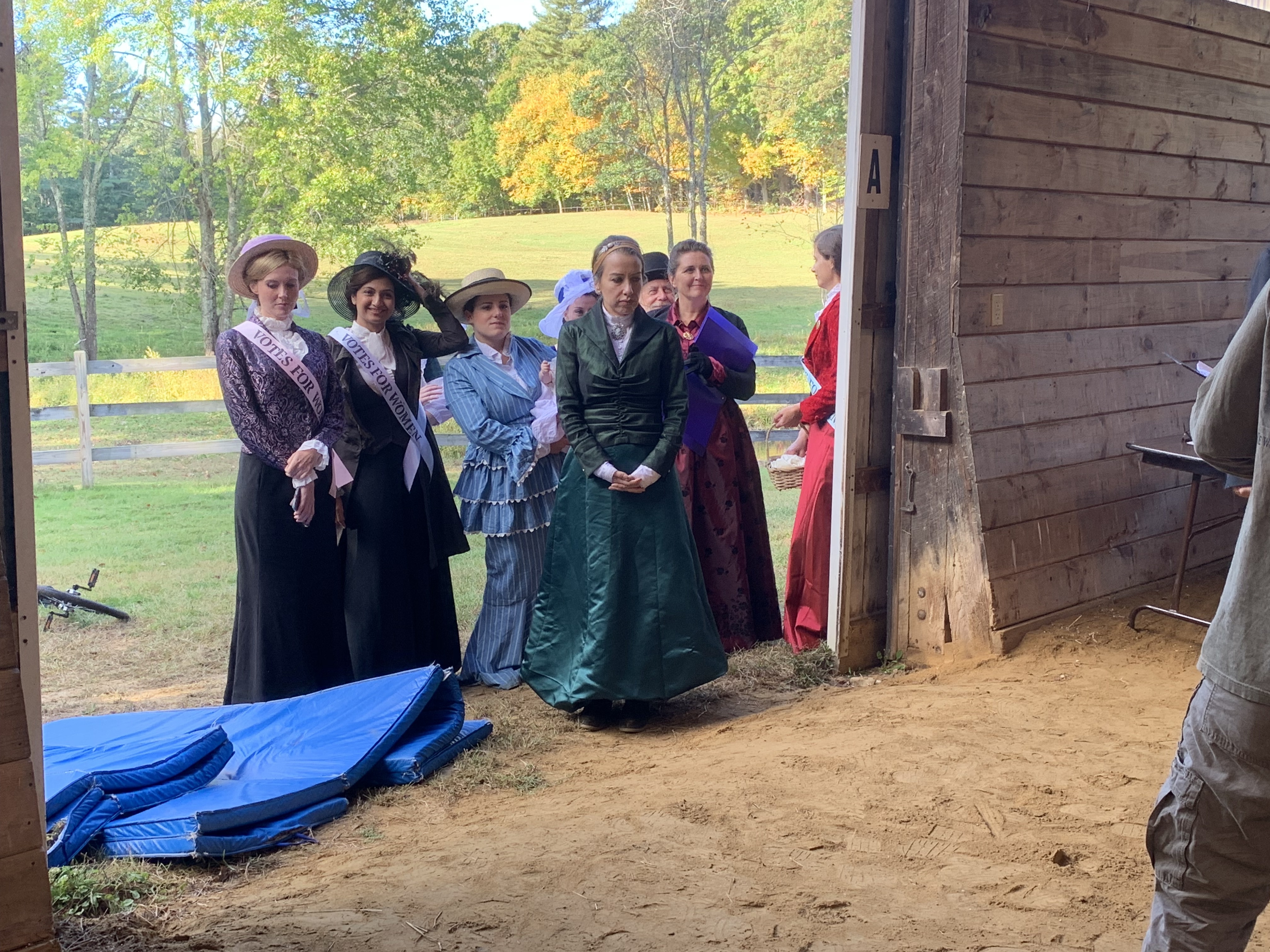
One scene shot today included basically all the speaking female characters which I thought illustrated my approach well. Most of the characters are young women, many of them suffragists. I never managed to get a picture where every one of them was visible, so I'll have to show you a couple. But since I was kind of locked into a silhouette, and of course my sizing options are always limited, I tried to give each their own color and vary up the kinds of pieces making up that silhouette as possible.


The basic look is long, solid colored straight skirt, white blouse, and maybe a coordinating jacket. Upper class Edwardian women often wore "suit dresses" like this. So I tried to find as many iterations of that as I could. Patterned jacket over neutral black skirt. Long coat and coordinating vest over neutral skirt. Bolero-jacketed full suit. Faux suit of patterned jacket over skirt in a similar color. Faux dress look of a skirt and blouse that match, or nearly so, with a neutral black bolero. The light blue dress on Ashley was her own discovery, the suit-like lapels bridging the gap with the other costumes.


Here's another view of some of those looks, plus one more, the mill owner's daughter, played by Kate Eppers. You can see they're also each in a distinct color. Purple, brown, light blue, deep blue, green, red, burgundy. I find that, while it is painting with something of a broad brush, it's an easy way to distinguish characters from each other, and audience members have an easier time remembering who is who.


I wish I'd been able to incorporate more true dresses. [personal profile] inwaterwrit, who is wardrobe mistress on the Mrs. Hawking plays, has a preference for dresses rather than separates, and it would have been a way to include more variation. I tried to create the illusion of a dress with the very similarly colored burgundy blouse and skirt on actress Autumn Allen. But I don't have a lot of dresses that would look appropriate for informal Edwardian. I almost put the one I did have, in bright pink, on Kate, but I became concerned it would appear too close in color to the red suit. I went with the green look to spread the palette more. The green is attractive and interesting, though that satin shows every crease on camera, and it's probably the least accurate with its standing collar and three-quarter-length folded-over cuffs. I also wish I'd had more hats. They all should have been wearing one, technically, but I ran out. But at least it's another way to get visual variation.

I might show you how I handled the men soon too. My approach is necessarily more limited there, but there are still opportunities for distinctions to be drawn.
breakinglight11: (Default)
This past August, when Bernie was here to help me move furniture, I rearranged my little studio space in order to make it more useable to me.

Originally it was kind of designed to be like an office, focused around a desk for typing on a desktop computer. Then I tried to sort of simultaneously make it a craft room, with another table off to one side for my sewing machine, and stuff like my dress form and steamer shoved awkwardly off wherever they would fit. But I wasn't really using it lately; it felt crowded, particularly with the third-floor slanted ceilings that even as a short person I always seemed to bump my head on. The space was really going to waste, so I wanted to do something with it that I would actually use.

After some consideration, it seemed like the most useful focus I could give it based on what tasks pop up in my current life, was to turn it into a costume room. Wardrobe is the most space-consuming project I do on a regular basis, so I thought that would make the room the most helpful and most frequently utilized.

Work tables


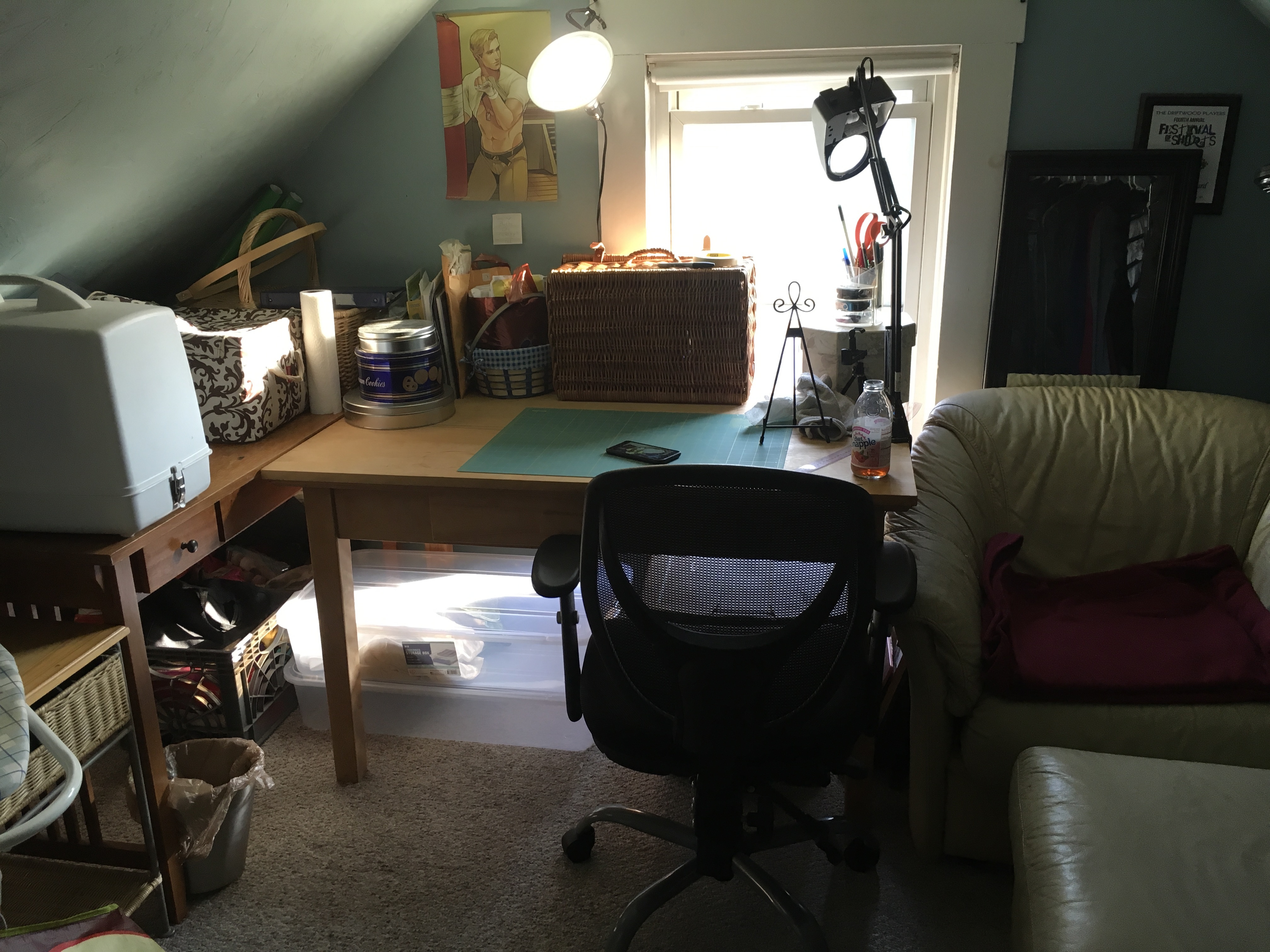
There is one window, and while it doesn't give a ton of light, I wanted the tabletop workspace to get as much of it as possible. So I ditched the ancient desktop and arranged both the former computer table and the craft table here. I put the smaller table in the corner under the slanted ceiling, which helps keep it away from my head, and put my notions box and fabric basket on it. I decided to store my sewing machine in its case in order to protect it from dust when I'm not using it. The table with the larger surface will be for work, though I stuck my sewing books and patterns on it against the wall. (Under my fanart poster of Steve, a thoughtful gift from Jane Becker.) The metal cookie tins contain thread, buttons, and other bits and bobs, because I was raised in a family descended from immigrants. The wicker picnic hamper does not usually live there, as I don't like blocking the window, but I am packing it as a travel supply case for a wardrobe mistress job I'm doing to help out the Traynors, who did fight choreography on my film.

Adelaide


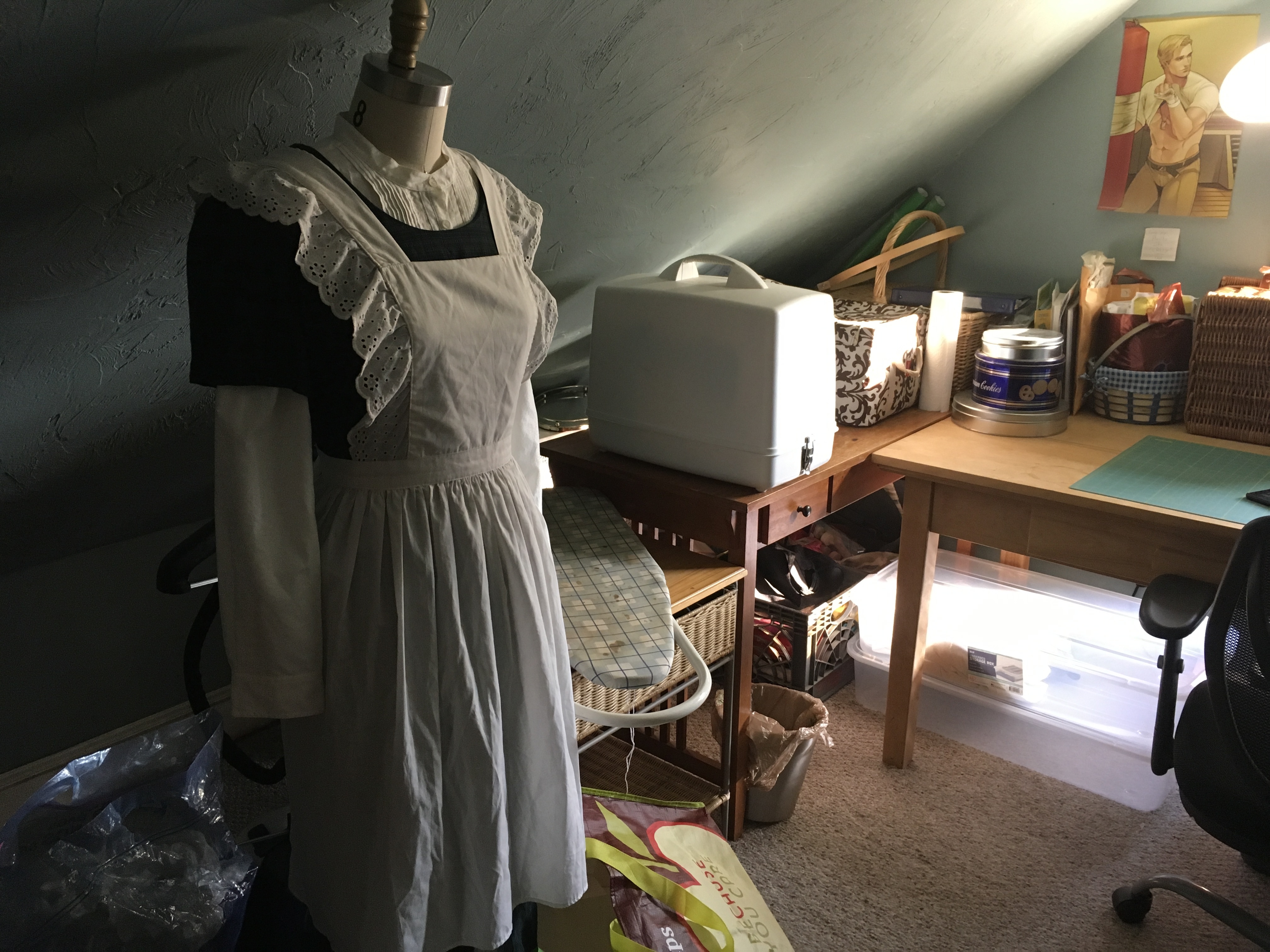
There used to be a low coffee table in here-- I thought it would be more accessible surface space under the slanted ceiling --but I basically never used it and it just collected papers that needed filing. So I finally dealt with all the papers, moved that out, and now it's at the foot of my bed. I also got rid of my printer, which still worked but I never used because it wasn't compatible with my iPad. So I repurposed the printer table for my ironing board, and although it might be stored there I'm not sure it's all that useable in that place. My dress form, Adelaide, still has the problem of being too tall for the room; you kind of have to constantly push her out of your way, but I think she's mostly okay where she is. The steamer, also a little too tall, lives behind her and is less of a problem there.

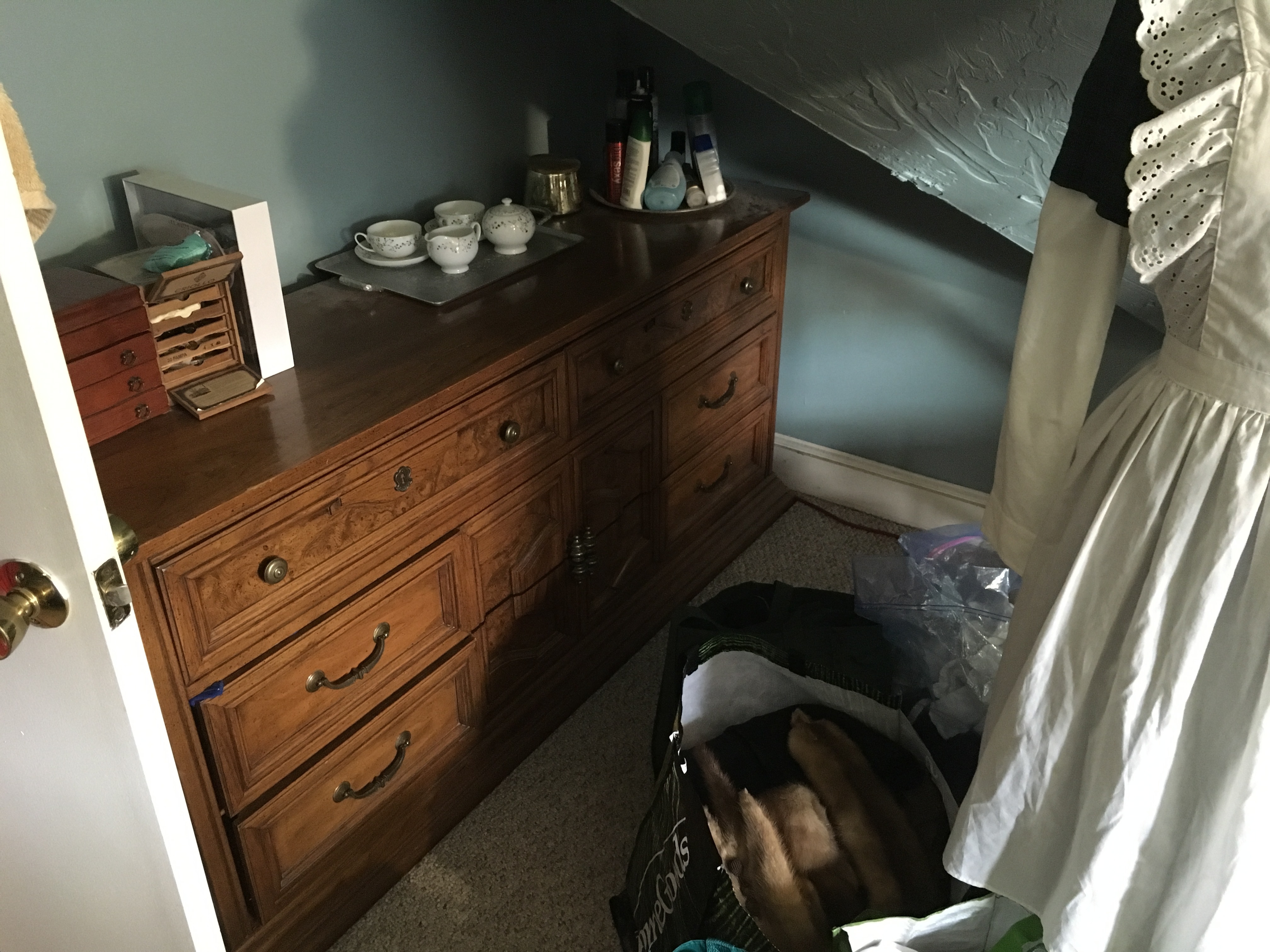
As you can see, there are bags full of costumes I have arranged for the aforementioned film I'm dressing. Adelaide is currently modeling a possibility I was assembling. The bags take up a lot of space, but they're much less in my way in this costume-specific room. They do, however, make it a little difficult to get to this dresser. It's kind of a pain to access at the best of times for something I go into every day. I never wanted that dresser in here, tucked under this stupid alcove, but it's so big it won't really fit anywhere else.

Giant dresser


I also took my extra IKEA clothes rack, living many years disassembled in a closet, and put it up in this little corner where the craft table originally lived. I really like having a place to hang costumes I am currently working on in an easily accessible way that doesn't choke up my closet space. Currently it is full of suit bags of men's looks for the film wardrobe, as well as some jackets that I am considering as possibilities. On the ground are more bags, mostly with womenswear.

IKEA rack


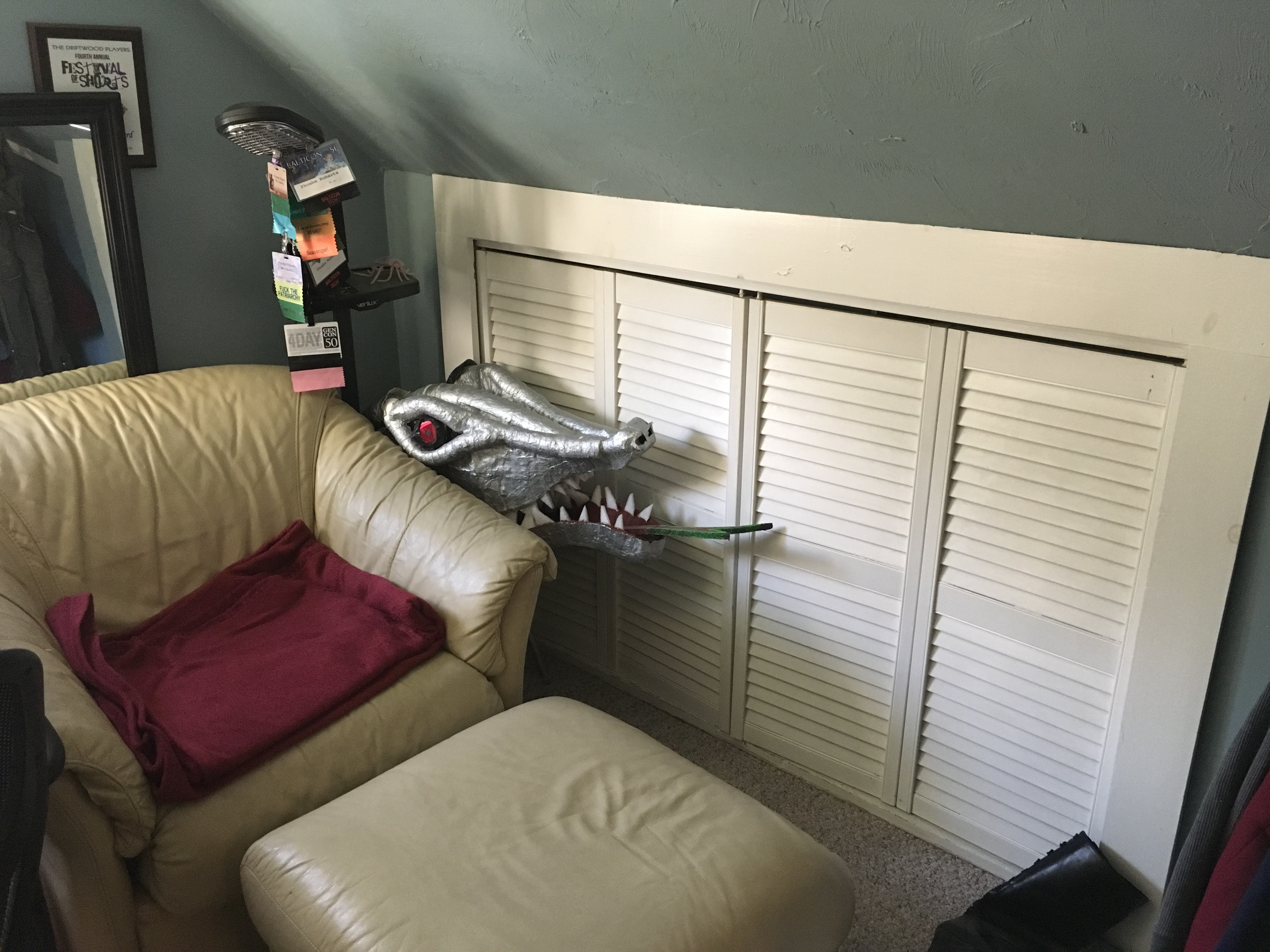
It's much, much more useable now, and it seems devoting it to costuming was indeed the right choice. The old white leather armchair, scrounged from my parents' living room set from many years ago, remains beside the big table where it always was, for me to sit in when I haven't covered it with costume pieces. The only problem is my Tiamat head, which used to live between the chair and the table, but now doesn't fit there anymore. The chair is very carefully set exactly far enough away from the side closet for the door to open, but with the head there it's blocked. I do go in there fairly frequently for supplies, so having to move it is a pain. But I'm not sure else where it can live, so it's the one problem with the new layout.

Tiamat head


Heh. She looks like she's peeking out of a den for your attention.

Overall, I'm very happy. I was worried I was going to be unable to store all the craft/costuming/theater shit that I had tucked away if I moved things, but other than Tiamat, it's been no problem. It was also a good call to get rid of some things, so it felt like crowded and I could actually want to be in it. I'm really glad I finally went to the trouble, especially since I'll have a new Hawking show to costume this fall.
breakinglight11: (Default)
I went in as a guest speaker for a friend's theater class this week. Cari's husband Aaron asked if I could give a lecture for a class he was assigned at North Shore, and I decided it might be fun to introduce the idea of costume-choices-as-narrative. It's something I LOVE discussing but have very little opportunity to focus on in my regular instruction.

Bernie made the intriguing suggestion of choosing a particular character whose wardrobe changes with their nature and their circumstances, and explaining how it helps support telling their story. He recommended Captain America from the MCU— seeing as I knew him very well, the students were likely to have some frame of reference about him, and I likely wouldn't even need to look up a ton of visuals. My iPad is already choked to death on them, after all.

Of course, he and some others I mentioned it to warned me not to be too gross about discussing how Chris Evans looks and was dressed. The students didn't know me, after all, and I didn't want to seem creepy. I was a touch indignant, but acknowledge the point. The class was to be about the clothes and styling choices, after all, and while casting definitely affects how they make those choices, I didn't want to muddy the focus.

The hilarious thing was, THEY couldn't stop talking about how hot he was. The few times I had to rein them back into the discussion, they had gone off talking to each other about it— boys and girls alike. I managed to stay uncreepy, I think, but that amused the hell out of me.


I explained things about where the character was at any given time. How they made him look as unflattering and unimpressive as possible when he was skinny and asthmatic with clothes that didn't fit great, were in dull colors, and had 1940s period touches that read as "dorky" today, like short ties and suspenders. How even post-transformation he is still the same modest person on the inside, so still prefers conventional, low-key styles in a blue, white, and gray color palette. How when he first arrives in the 21st Century, he dresses in clothes that a person could have worn at any point between then and 1930 without really seeming strange, but would look at home on any grandpa— pleated, high-waisted trousers, blue plaid button-downs. But even when he updates his look to be more contemporary, with lower rise jeans and jackets with high-tech fabric and interesting seaming, he still sticks with simple looks that do not draw a lot of attention. How his one small dressing affectation is a love of brown leather jackets, likely learned in the army, that he updates with more and more modern styling periodically. How they keep him in those palette and styling parameters to contrast with Tony Stark. He's old enough to be Steve's father, but Tony is flashy and attention-seeking, with more red and black, dressing young for his age where Steve dresses old, in designer suits, graphic T's, and glasses with colored lenses. I dealt with the superhero suit as well, of course, but in a more general sense, pointing out its evolution through the circumstances in which Steve wears it, how it got more modern and functional in design, and how its breakdown is used to demonstrate how low he is by the time we've gotten to Infinity War.

I also brought in things about Mrs. Hawking, pointing out that theatrical circumstances require broader strokes, and how we work on a limited budget. I pointed out how many characters are associated with certain colors, like Clara with green and Mary with blue, to help audience members identify them, and to draw contrasts and connections. I pointed out how Mrs. Frost's blue and white is her attempt to seem innocuous, so when Clara confronts her in green and black she looks oppositional and threatening against her, and how Clara's fur coat functions like a form of armor. I compared Mrs. Hawking's super suit to Madam Malaika's, how they served to both underline the women's deep similarities as heroes as well as their vast differences. I pointed out how in Frost's scenes there is basically no color except HER color, and the significance of her tying it around Nathaniel's neck is a declaration of her power over him.

I wanted to give them a taste of everything you can do, and how creative you can be to say things with your choices. I had to pick and choose a few evocative moments, as there's so many possibilities for how costuming can be used. There are dozens more things in Mrs. Hawking that could be discussed on this level. And I tried to keep things a little on the simple side for the sake of introduction.

Like, I cut out some of Steve's outfits like the athletic wear in the "On your left" scene at the top of Winter Soldier. I'm ninety percent sure they have a relationship with Under Armour that required them to dress him in a way that made him look as hot in it as possible, but I don't really think it's totally diegetic that he'd wear his clothes that tight. It's not just too showy; it's borderline vulgar, to be honest. I think you can justify it in-story with the idea that he's never totally come to "own" his new body, to reconcile the reality of it with his self-image, and so doesn't have the best sense of what's going to fit it. But honestly, the character that they've established him to be is going to be slightly embarrassed to go outside like that, in the absence of concerns like "using Chris Evans's considerable assets to sell tickets."

I've always wanted to teach a full-semester theory of costume design class, but never have had the opportunity before, so this was super fun for me. It also makes me want to do a fuller exegesis on Steve's journey through costuming, about what all his looks say from a narrative standpoint. It's a study I'm fascinated by, and I had so much fun getting to teach other people about it for a little bit.
breakinglight11: (Default)
I like letting people borrow my costuming. It helps justify my owning it; it gets more use, and I can help out people who need the stuff and do not wish to live in the clothes-storage-hell of my own making that I do.

Recently I agreed to lend out two of my cutaway tailcoats, so I had to dig them out of the overstuffed closet in which they live. Now, as I have previously established, I own a LOT of men's formalwear. A ridiculous amount for a single largely femme-dressing woman. Dozens of pairs of tuxedo pants, vests, and wing collared shirts, as well as a variety of jackets. Said formal cutaways for eveningwear. Black frock coats, gray morning coats, even a few standard modern tuxedos that I don't even know why I bother keeping, when I mostly only need stuff that looks period. Even a set of white tails and a white Nehru jacket, which was repurposed for a particular costume in Mrs. Frost.

I had to dig through these to find the coats I wanted. Most of these were bought with very specific purposes in mind, mostly Hawking costumes for particular actors, or snagged when I saw them in thrift stores because they don't often turn up there. But I realized when I was conducting this search the other day that I also have...

...a black morning coat.

I never bought a black morning coat. Only gray. Morning coats are actually kind of hard to find, especially at my price point, given how infrequently Americans ever have cause to wear them. I'm actually kind of pleased, as it's useful for me to have it. But I checked with Jenn, it's neither of the black morning coats SHE owns. Nobody else has ever lent me one. So where the hell did I get it? Thrifted? They're NEVER in thrift stores. Grabbed something off of eBay that was accidentally daywear rather than eveningwear? How did I never notice this before? How do you get to a point in your life where you own so much men's formalwear you don't even notice when you pick up a relatively obscure style by accident?

There is only one answer. THEY'RE REPRODUCING. As if I didn't have enough costuming, now it's making more of itself. Black must be the recessive gene, to have emerged as the child of two gray ones. Soon I will be as Australia, overrun by invasive species, only rather than rabbits for me it's men's formalwear.
breakinglight11: (Default)
Couldn't sleep last night for some reason, so I found myself diving down a Victorian research rabbit hole. Last nights topics included wedding dresses of the various periods, police uniforms, and Jack the Ripper. Some of this was curiosity— I'd started wondering what sort of wedding dress Clara Hawking would have worn, seeing as she and Nathaniel were married in 1876, while my previous research has focused on the early '60s for Mrs. Hawking and the late '80s for Mary. Also I wanted to know if 1880's policemen would have had dress uniforms. As far as I can tell, Arthur would wear civilian formalwear in dress occasions, and it turns out I've been bringing in the leg of mutton sleeve a touch early; it was more of an 1890's thing.

While it was mostly musing that drove this, both these subjects are at least peripherally relevant to writing the next Mrs. Hawking story. None, however, more so than the Ripper stuff.

I'm planning on making the Ripper murders the substance of the next play's case, which means I need to know the particulars of what happened. I'd like to fit my story into the history as neatly as possible, particularly when it comes to the timeline. I know the broad strokes of it quite well, but the specifics are very complicated. One thing that presents both a challenge and an opportunity is that the facts of the case are not exactly what you'd call clear. Police procedures of the time were limited and often slipshod. Cops relied mostly on eyewitness accounts and catching people in the act to apprehend criminals, and did not have much in the way of forensic techniques— it's why Sherlock Holmes's evidence-based deductive tactics were so revolutionary. It means there are a lot of details and events to take into account when I'm building my story, but it does also allow me to take advantage of how much uncertainty, error, and poor record keeping affected even the contemporary understanding of what happened. I'm going to be have to be judicious, since I definitely don't want to throw the history out the window. But I know the general purpose of the story I want to tell, and fitting it in may be difficult.

I've got to do more research. Incidentally, I see Clara wearing something like what Princess Louise Margaret of Prussia wore to marry Prince Arthur:

breakinglight11: (Default)
I have been bitching and moaning a lot lately about the amount of costuming I own. It's just getting to the point where it's outgrown the storage space I have for it and encroaching on living space. I'm lucky in that I have a lot of closets and places to tuck boxes away, but I have had to get increasingly inventive and put things in places where I find them an imposition. I think the only real answer is to do a serious culling, but I'm reluctant to do it due to the nature of building and making use of this particular kind of collection.

The Victorian stuff is the most important part of it. I need it for the Mrs. Hawking plays, given how large an element lush and attractive costuming is for those shows. In the most recent piece, Mrs. Frost, most characters had three or four outfits, and nobody had less than two. We have mostly the same cast coming back for the performances, but I try to keep some alternative sizes on hand in case a new actor has to sub in. Having multiple options that way makes the collection larger with things that don't often get used, but it's necessary to accommodate changes with any efficiency.

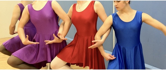
Since that's the majority of what I'm doing right now, it might make sense to keep only the Victorian stuff. But I have so many things that are unique and interesting such that if I ever do get rid of them, they're basically irreplaceable. They were dug out of cleared-out theater storage, or found in thrift stores. They don't get used often at this point, but I often find I have exactly the perfect thing for a larp, or another show, or to lend to somebody who needs it that I can't bear the thought of tossing the cool interesting stuff even if it doesn't get much call. I just repurposed a dance costume I bought for "Lame Swans", the photographic graphic novel I made in grad school for an Intercon costume I'm really pleased with. That thing's been shoved in a plastic bin for like five or six years, because I liked it too much to get rid of it. I feel vindicated in a way. But it doesn't solve my storage problem, or the feeling of being overwhelmed by the space demands of my collection. Hell, I still have ALL the costuming from the Lame Swans project, including enough simple solid colored skirted dance leotards to outfit a small army. SERIOUSLY, IF YOU NEED TO DRESS AN ARMY OF SOLID COLORED BALLERINAS, HIT ME UP. I GOT RED, PURPLE, DARK BLUE, AND LIGHT BLUE.


I was also struck pretty strongly by the experience of dressing the ensemble for the large ballroom scene on the Mrs. Hawking film. I used almost every single ballgown and tuxedo piece I owned— WHICH IS A LOT —to make that happen, and it would have been literally impossible if I hadn't had so much at my fingertips. I found that process to be pretty brutal, honestly, even with the enormous amount of help Jenn gave me to get everybody actually properly dressed, so the idea of anything that might have made it harder is kind of terrifying. But it makes me even more nervous to get rid of stuff, because I've seen how much help it can be to have it on hand.

I think I need to sit down with an obliging friend (Jenn seems like a good candidate) who can help me get some outside perspective on what's actually special enough to keep and what is just taking up space. It occurs to me that the weird color obsession I have with dressing the Hawking characters might help me make decisions about the Hawking stuff. For example, light blue womenswear has been pretty exclusively limited to Mary and Frost, so if I've got a light blue piece that neither of them is likely to wear, I should probably thank it for its service and release it into the wild, Marie Kondo-style. I think an additional brain or two with less subjective concerns might help.

If I don't do something, I may be crushed to death in the impending tuxedo-pants-and-eighties-prom-dress avalanche.
breakinglight11: (Default)
Tonight on a whim I decided to take a real crack at putting together a drag look. I've wanted to do it for a while now, but thus far the only practical progress I'd made was ages ago. But I saw a really cool drag king look on the Internet and it inspired me, so tonight I brought my developing drag persona, Alexander Brandy, out to play for the evening.

Since I cut my hair, that issue with the look was taken care of. What I really needed to practice was the makeup. I'm familiar enough with the principles of drag makeup— use dark colors to make features recede, and light colors to make features stand out —but I don't have much practice, and the bit I do have I'd only done previously in the service of beauty makeup. So I watched a tutorial of a drag king doing his paint and roughly followed along. I went darker than I usually do, in an effort to broaden and deepen my features, in an effort to carve away the softness and make things a little coarser in a way we associate with masculinity. In my effort I darkened my eyebrows, widened my nose and forehead, carved out my cheeks, extended my sideburns, and broadened my jaw. It's always tricky for me to make contouring not look like just dirty smudges on my skin, but it tends to show up better in pictures than in person.

IMG_4411


IMG_4415


IMG_4413


IMG_4414


IMG_4412


IMG_4416


I also put on my men's clothes, which are unfortunately too large for me, but tried to take them in a little bit with pins— enough to make them appear to fit, but not so much they emphasized my feminine body shape. I'm not exactly a curvy girl, but my waist definitely pulls in. There is also the issue of my decidedly unmasculine proportions. While Phoebe likes her petiteness, Alexander is a bit self-conscious of his size. So to make him look a little more manly, we made an attempt to pad.

I didn't bother to bind my breasts, just smushed them with a sports bra, since they're not that obvious anyway, but my chest seemed weirdly hollow for a man. I have NO pecs, which while a bit surprising given the kind of workouts I do, I actually am quite pleased with; I like the look of how I have kind of big arms and a very small, narrow chest. But it looked wrong on Alexander, so in an effort to make him a little more swole, I stole one of the bustle pads out of the Hawking costumes and stuffed it into the sports bra just under my collarbones. (That thing has been an ass and now a chest!) I'd already had the padded bra I cut in half for shoulder pads and put them in as well. I'm not sure how well-balanced they were together, but I think it's the right direction to work in. A vest and tie completed the look. Nothing fits great, though, and I think I look a bit too "hippy" in the full-length shots.

IMG_4417


IMG_4418


I am vain enough that if I'm going to look like a guy, I want to be a cute guy. I just do not have the proportions to be the kind of guy I find attractive, even with the pads. Also what I find most beautiful in women (which I shoot for in my regular look) tends to be pretty diametrically opposed to what I find most beautiful in men. I may be able to shoot for that "delicate chiseled modelesque" kind of handsome, but my makeup skills will have to improve.

I also tried the look with facial hair, defaulting to the goatee with the jawline beard, a look I often like on men. I was aiming for something a little more Tony Stark-esque. Instead I seem to have turned myself into a young Hans Gruber. Not what I was expecting, I have to say.


Guess we know who I'd have to do for Snatch Game. Or whatever the drag king equivalent would be. "Chust anotha American cowboy who's seen too many movies?"
breakinglight11: (Default)
I am a costume designer at heart. One of my favorite things about the third Thor movie?

Hela takes Loki's green.

After she shows up, they fight her, and are separated from her? Loki never wears green again. His magic stays green, probably because that's so firmly established, but his iconic costuming disappears. All remaining green-- other than that in reference to the Hulk --only refers to Hela.

What does he wear instead? Blue and yellow-- deconstructed green. As his role in the story, and in Thor's life, is deconstructed in the text.

Love that. COSTUMING IS THE BEST.
breakinglight11: (Default)
Had a second crack at my Crow makeup! I think I made a real stride forward.

IMG_3628


This time I remembered to prime my skin first, the way I did for my Death makeup, and it made a big difference. I used Nivea Men's Post-Shave Balm, which is a great cheap primer for full-face makeup. I also made more of an effort to "pat" the greasepaint over my skin with the sponge rather than drag it. These combined to make a much more even white expanse, unlike the streaky, uneven version from last time.

27BBBAFF-B58C-4AE9-A837-B426FD68A21A


It had the effect of being kind of aging, emphasizing my eye bags, rather than the smooth, less patchy result I got this time. I also took the picture in better natural lighting this time, which likely helped.

That was the biggest difference. But I also used better products this time. I bought black and white eyeshadow, as well as an actual black lipstick. They're just Nyx brand, not super high quality, but okay. I attempted to highlight with the white, but it didn't make much difference, so I then switched to trying to use it as powder to set the greasepaint. I also contoured with a much lighter hand, and even though it doesn't blend with the greasepaint very well, I think I achieved more of a carving effect, rather than just making dark places on my white mask.

IMG_3630


The last thing I did was take a little more care about my eyeshadow. I filled in the entire expanse from my lid to my brow bone-- which is not much, since I have Cara Delevigne-style heavy, low-set eyebrows --but with a careful angle from corner of my eye to end of my brow. I also didn't go too close to the insides of my eye, or too far below it, which I think makes things look neater and brighter.

IMG_3631


It's certainly not perfect. My eye and mouth spikes are still a little sloppy and not as opaque as I'd like. I should probably just use liquid eyeliner for that rather than pencil. I also notice there's a spot in my hairline that's still noticeably pink. And I'm just so damn sloppy when it comes to applying lip color. But overall, I'm really happy with this improvement. Not only do I think it looks closer to the Brandon Lee original, I think I look prettier in it. Never going to get mad at that!

IMG_3635

Profile

breakinglight11: (Default)
breakinglight11

May 2025

S M T W T F S
    123
45678910
11121314151617
18192021222324
25262728293031

Syndicate

RSS Atom

Most Popular Tags

Style Credit

Expand Cut Tags

No cut tags
Page generated Jul. 14th, 2025 04:46 pm
Powered by Dreamwidth Studios