A closet called CLOSET
Jul. 10th, 2020 01:47 amI should be asleep. But instead all I can think about is how, in the most 70’s interior design feature of all time, there was a closet labeled “closet” in the negative space of an earth tone racing stripe painted across the apartment in Welcome Back, Kotter.
Why can I not find a clearer picture of this, the most deeply iconic of bad taste in 1970s aesthetics? Why are there not more images of the closet labeled “closet”?
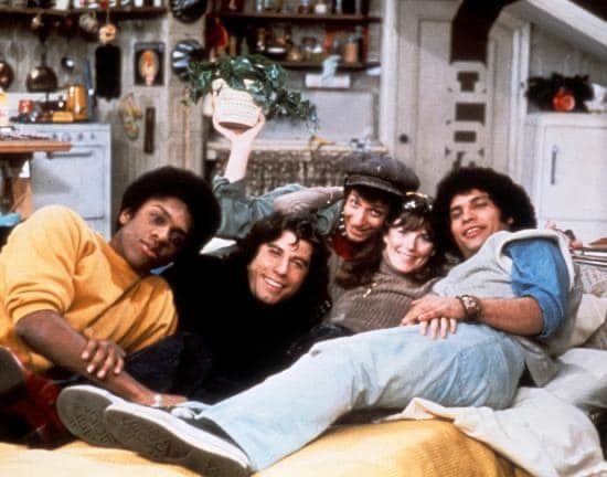
When I was a kid, I would sneak out of bed at night sometimes to watch Nick at Nite, which exposed me to Welcome Back, Kotter. The existence of the “closet” closet has obsessed me ever since.
Ah, here we go. The CLOSET:

What's funny is in my child's memory it was EVEN BIGGER and WEIRDER LOOKING. I recalled it as being burnt orange, and climbing up the whole wall in groovy 70s font. Compared to that, the reality is almost subtle and tasteful. Oh, the whimsy of childhood.
Clearly this is a home decor project I must pursue. ONLY MINE SHALL MATCH MY BLUE AND WHITE OLD LADY COLOR SCHEME. Can't you just see it here?
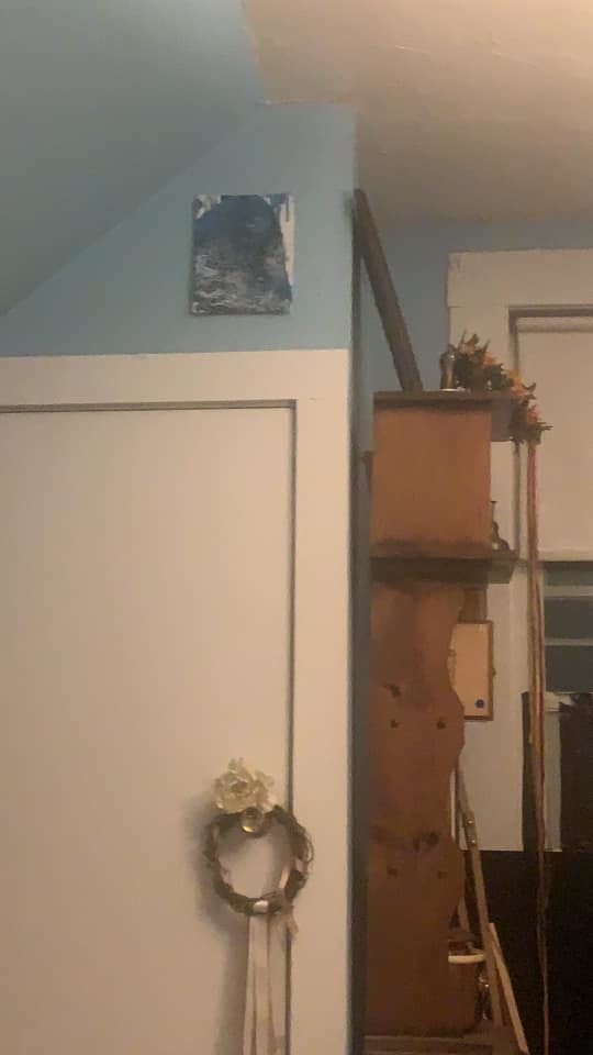
When I have a real person house, I will label EVERY door with CLOSET.
Why can I not find a clearer picture of this, the most deeply iconic of bad taste in 1970s aesthetics? Why are there not more images of the closet labeled “closet”?
When I was a kid, I would sneak out of bed at night sometimes to watch Nick at Nite, which exposed me to Welcome Back, Kotter. The existence of the “closet” closet has obsessed me ever since.
Ah, here we go. The CLOSET:
What's funny is in my child's memory it was EVEN BIGGER and WEIRDER LOOKING. I recalled it as being burnt orange, and climbing up the whole wall in groovy 70s font. Compared to that, the reality is almost subtle and tasteful. Oh, the whimsy of childhood.
Clearly this is a home decor project I must pursue. ONLY MINE SHALL MATCH MY BLUE AND WHITE OLD LADY COLOR SCHEME. Can't you just see it here?
When I have a real person house, I will label EVERY door with CLOSET.